KED Project Feature Before and After:
Open & Airy
Get the full scoop on one of our recent renovation projects to learn all about how we transformed this home from dark and dated to modern and bright.
Photographed by Kat Alves Photography
This month on the KED blog we’re providing some behind-the-scenes details of one of our recent projects Open and Airy.
If you’ve ever wondered what working with Kristen Elizabeth Design on a home renovation project would be like then this is the post for you! Keep reading for all the details below.
Project Overview
This home in Granite Bay, Ca needed a full remodel including the kitchen, family room, living room, master bedroom, and bathroom, along with the guest bathroom. Not only did we update the floor plan but all the products and materials along with the furnishings and accents were upgraded.
Our clients, a couple with three kids, knew they needed to update their home to function better for their family, but when it came to what that looked like they felt lost. That’s why they called in the KED team to guide them through the home renovation process. First, we listened to how they used the space and learned about what worked and what didn’t. We then created a design that ticked all their boxes, one that was modern and open bringing in breezy California style.
To learn all about how we achieved this transformation, keep reading!
Before: The original space
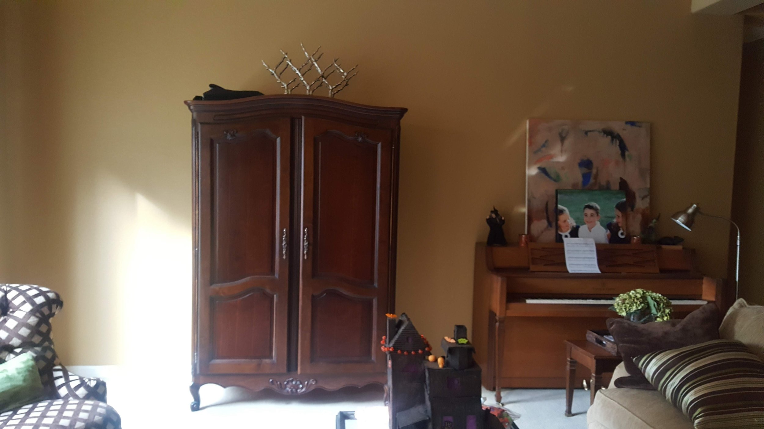
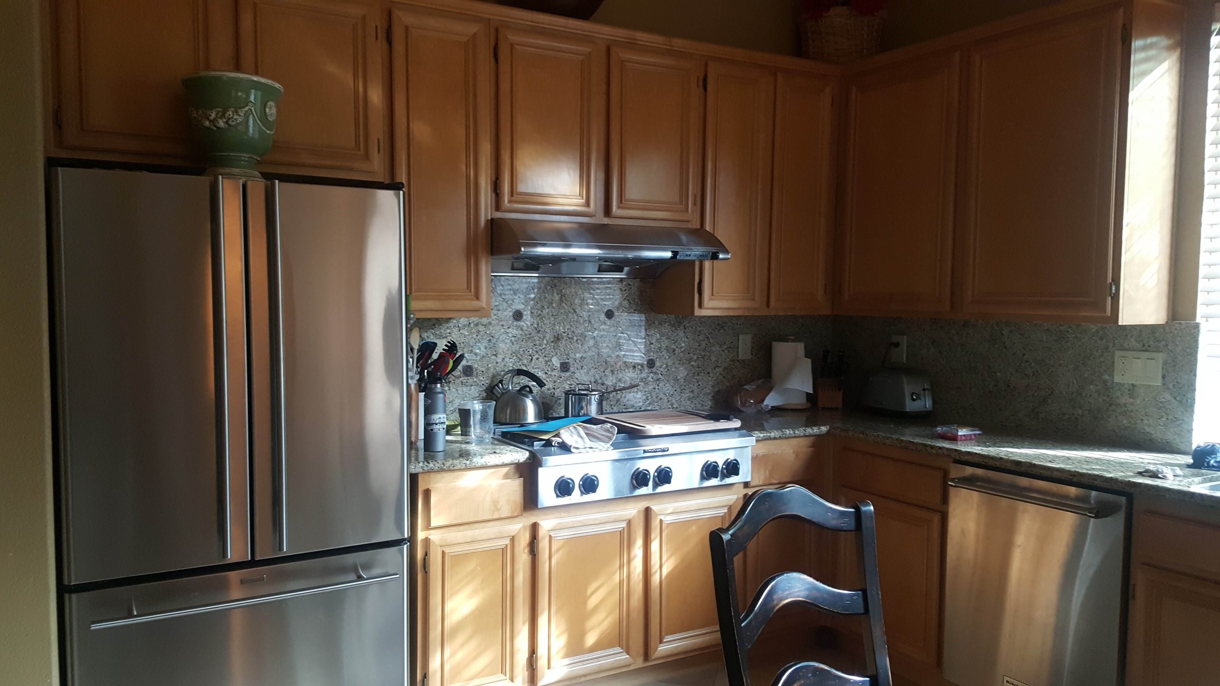
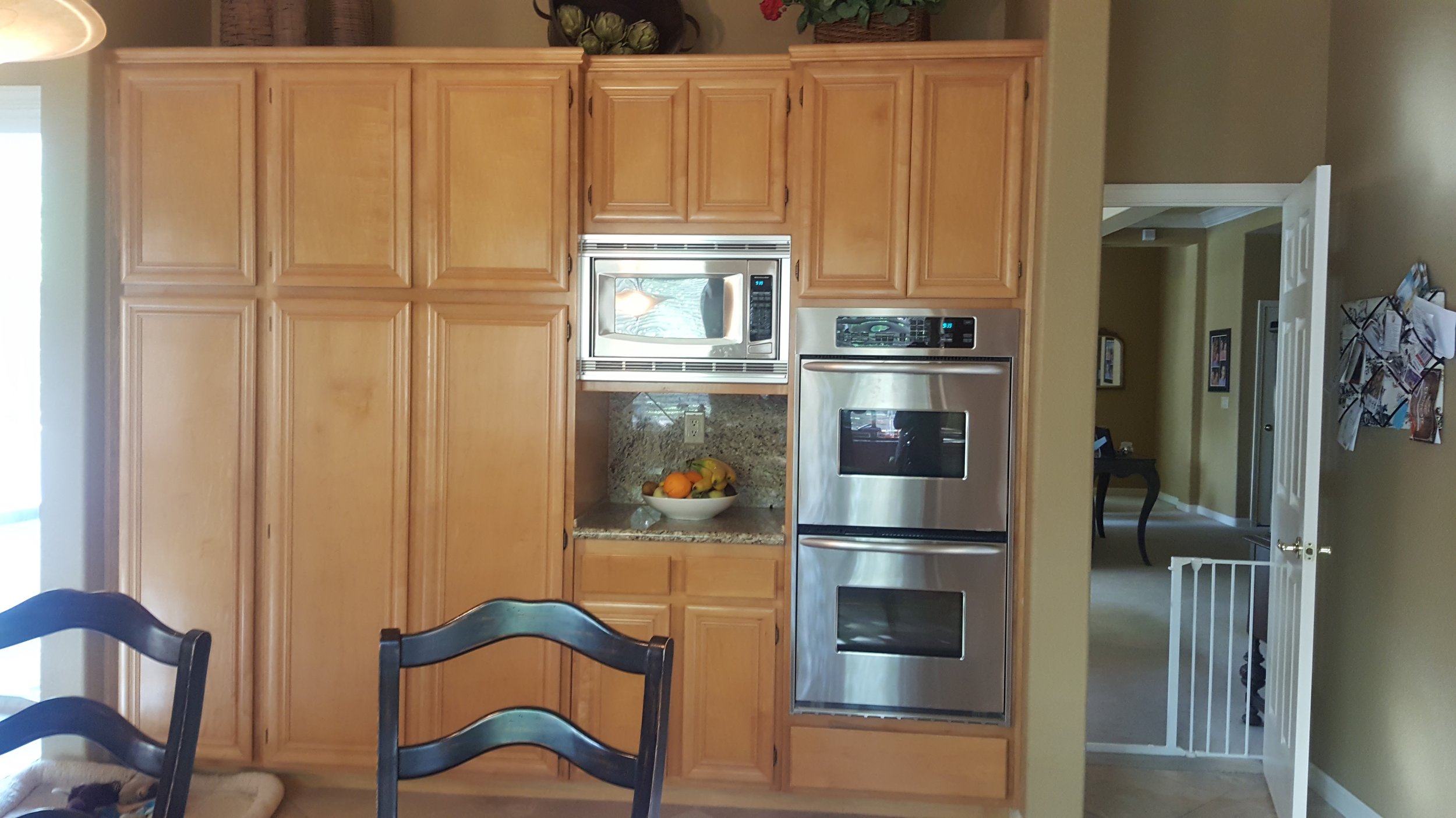
The original layout and design of this home was no longer working for this family of five. It felt cramped, dated, and impractical.
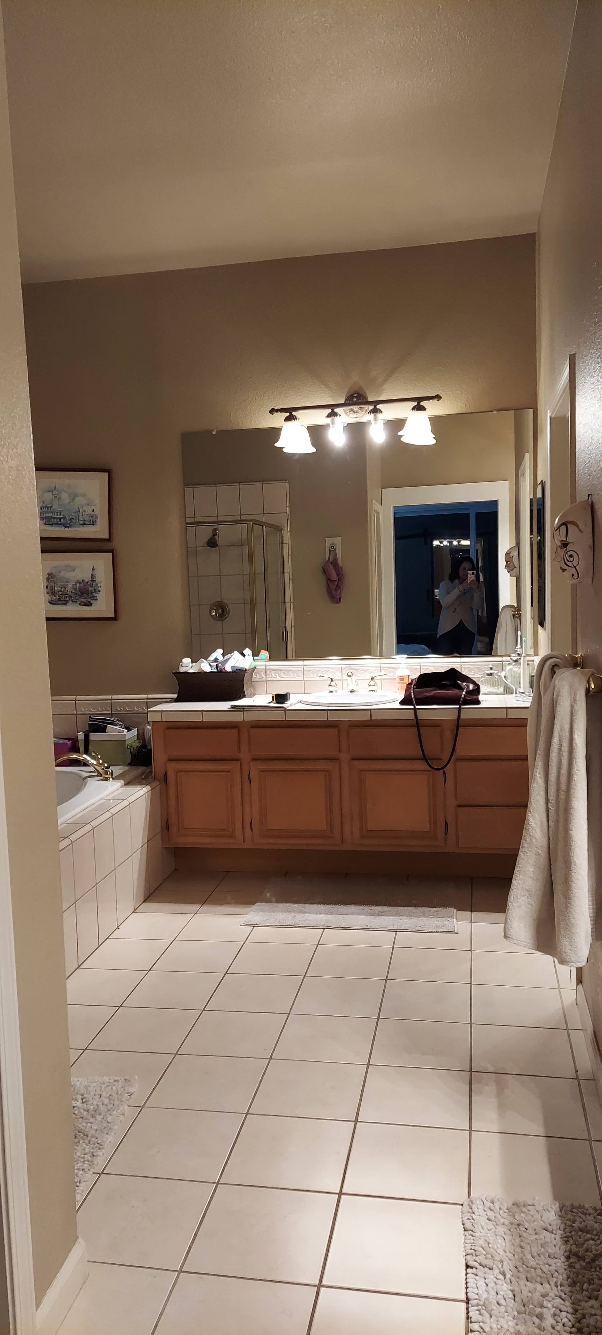
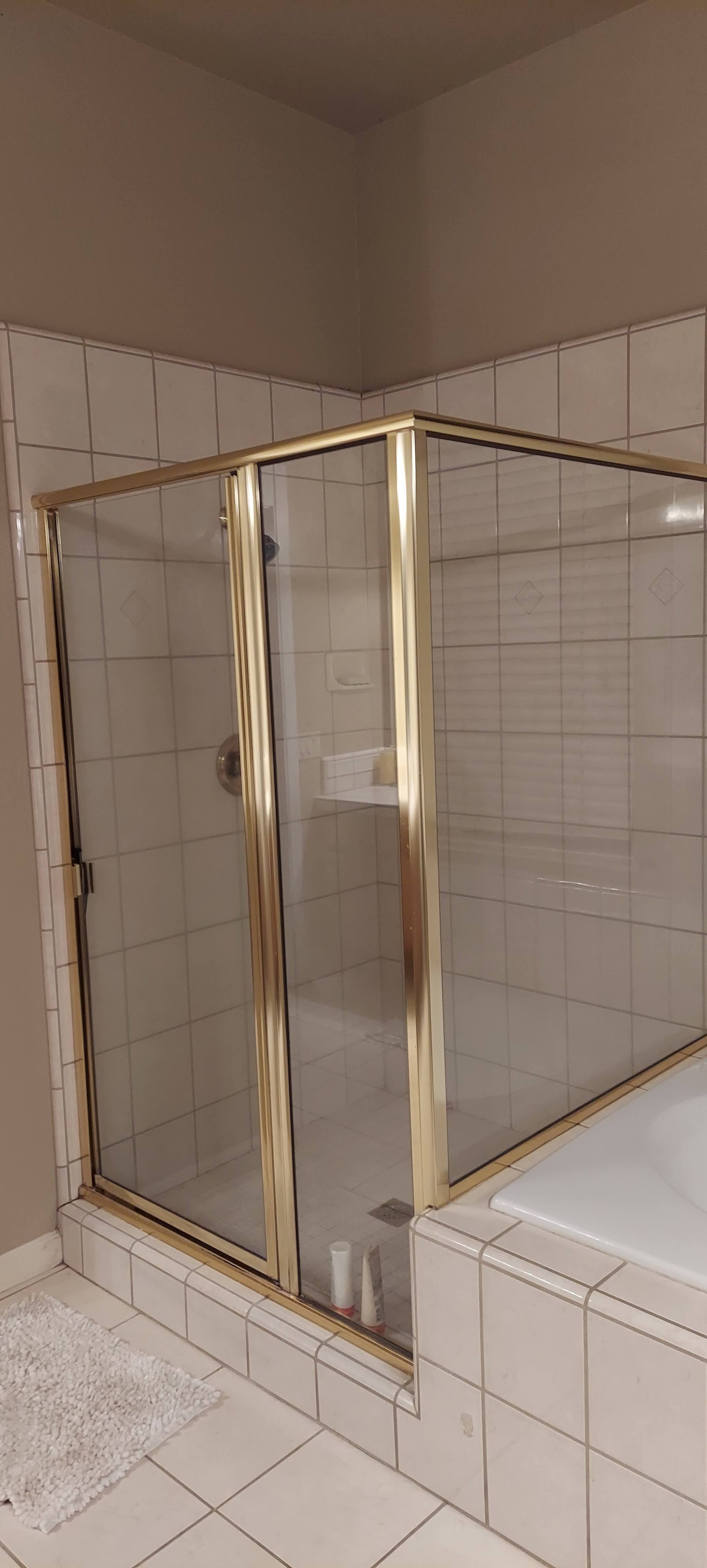
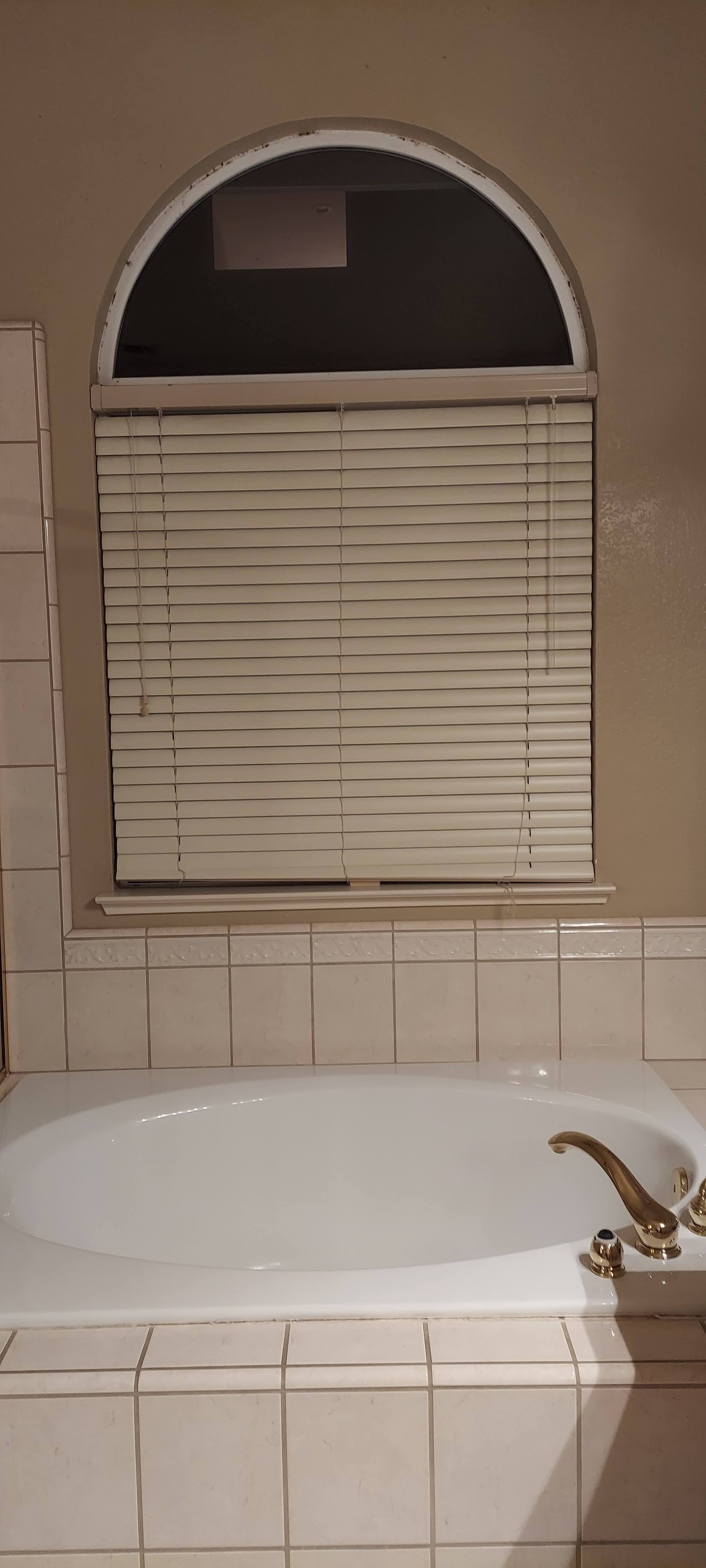
It was built in the 80s and the interior design reflected this (not in a good way!) From the honey wood cabinets and busy-looking granite in the kitchen, the dated tile and gaudy brass hardware in the master bathroom, to the carpet in the living room — it all had to go.
The clients wanted a kitchen, dining, family, and living areas that felt more open and accessible. In the original space, the kitchen and living spaces were divided, making them too traditional and formal. While the kitchen and family room were connected as a single space, which wasn’t functional.
The master bedroom and bathroom, along with the guest bath were all in need of modernization.
The Journey: Design Inspiration and Project Scope
To achieve the client's wishes we knew we wanted to create more space without adding square footage making the main living spaces more functional. In terms of style, the overall design aesthetic was contemporary California, with a blend of modern and rustic influences. The color palette was mainly neutral with whites, creams, grays, and wood tones with pops of blues throughout to add color to the home.
Since this was a full home renovation and our clients needed to live in the space during construction, we divided the project into three phases to make everything as manageable as possible.
Photographed by Kat Alves Photography
Phase 1: Kitchen, Living & Dining Room
The first step was to create an open kitchen and living area. This included removing the wall that divided the kitchen and living rooms, which allowed us to create a double island-style kitchen perfect for working and entertaining simultaneously.
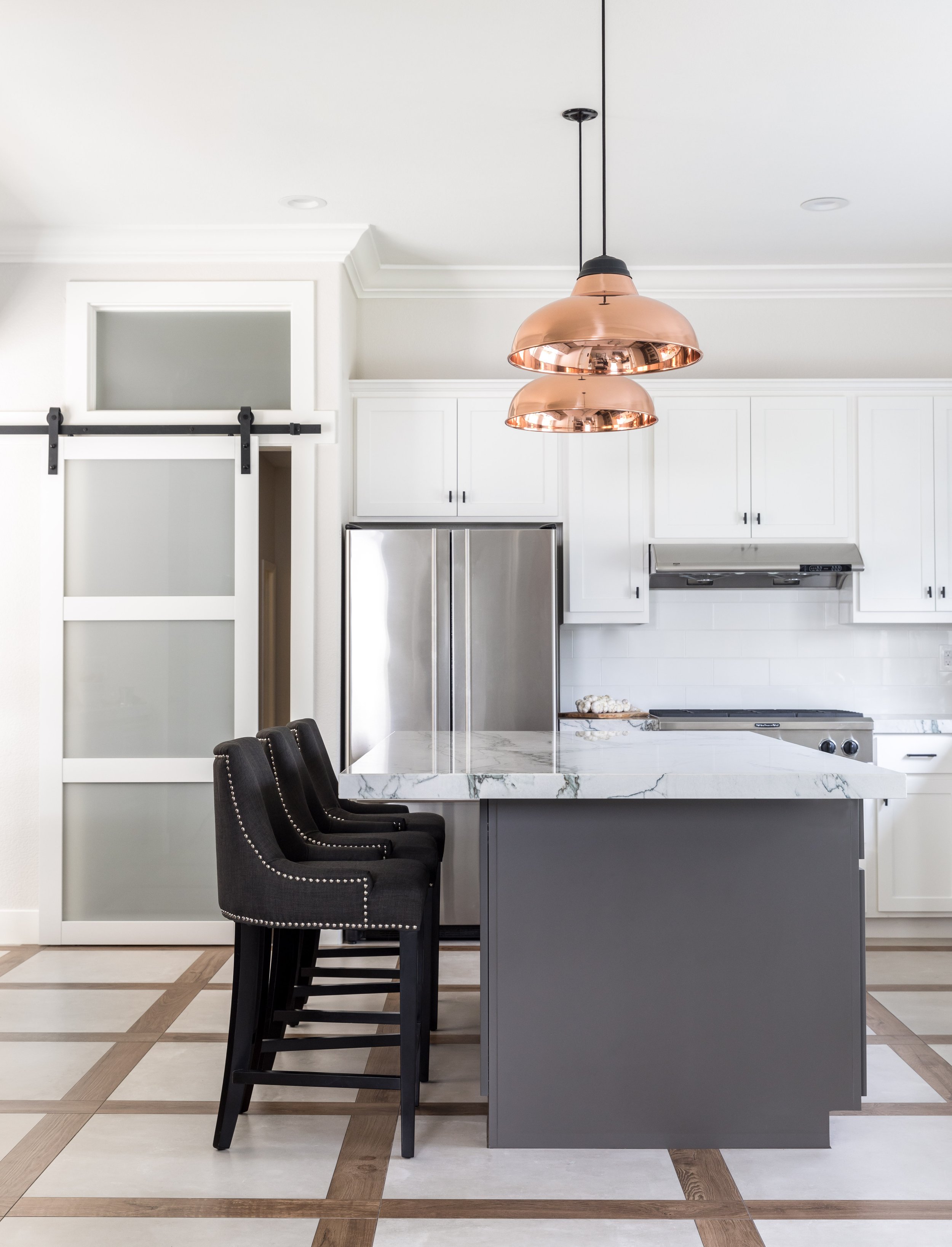
For the kitchen, we updated the face of the perimeter cabinets with new doors and drawers and added new cabinetry in key locations. A crisp white helped modernize the space and paired perfectly with the quartzite countertops. We used the same counters for the islands but painted the bases a darker gray for a nice contrast. By incorporating open shelving next to the sink we added visual interest and variation. The floor was updated with wood and tile in a stunning trellis pattern. All-new luxury appliances were vital to finishing off the space.
The peninsula helped create some definition between the kitchen and living area. While a custom live edge dining table by Old Growth Studios was perfectly situated between the two rooms creating a separate dining space. But one that is also functional for work or entertaining.
We designed a custom built-in entertainment center for the main living room as a focal point for the back wall with plenty of storage. The room is anchored with custom double sectionals that fit perfectly in the space. They’re just as comfortable as they are stylish so everyone in the family can enjoy hanging out.
To create better functionality for the kitchen and family rooms we pulled the dividing walls in and added custom pocket doors with frosted glass panels. This helped define the spaces as two distinct rooms. Giving the family the option to have the doors open to allow normal flow through the rooms, or closed when they need a quieter more private space.
With the kitchen as the connector, all three rooms could now be used for all the family’s needs including cooking, dining, entertaining, relaxing, and quiet time.
Photographed by Kat Alves Photography
Phase 2: Master Bedroom & Guest Bathroom
During the next phase of our renovation, we reenvisioned the Master bedroom and guest bathroom.
Like the other spaces, the Master bedroom was in need of a refresh. To make this space a haven for sleep and relaxation we created a soothing palette of blues and warm woods. The Rowe and Robin Bruce upholstered bed frame in a stunning slate blue color is the focal point of the space. We also added a custom walnut workstation that doubles as a shelf that houses the TV and family photos.
The guest bath (also kid's bathroom) was fully revamped pulling the blue palette through the house. The wrapped tile shower and fun double vanity make a bold color statement with cobalt blues and Spanish-style tiles, while the rest of the design elements are neutral whites, light grays, and black for contrast.
Photographed by Ellen Vanessa Photography
Phase 3: The Master Bathroom
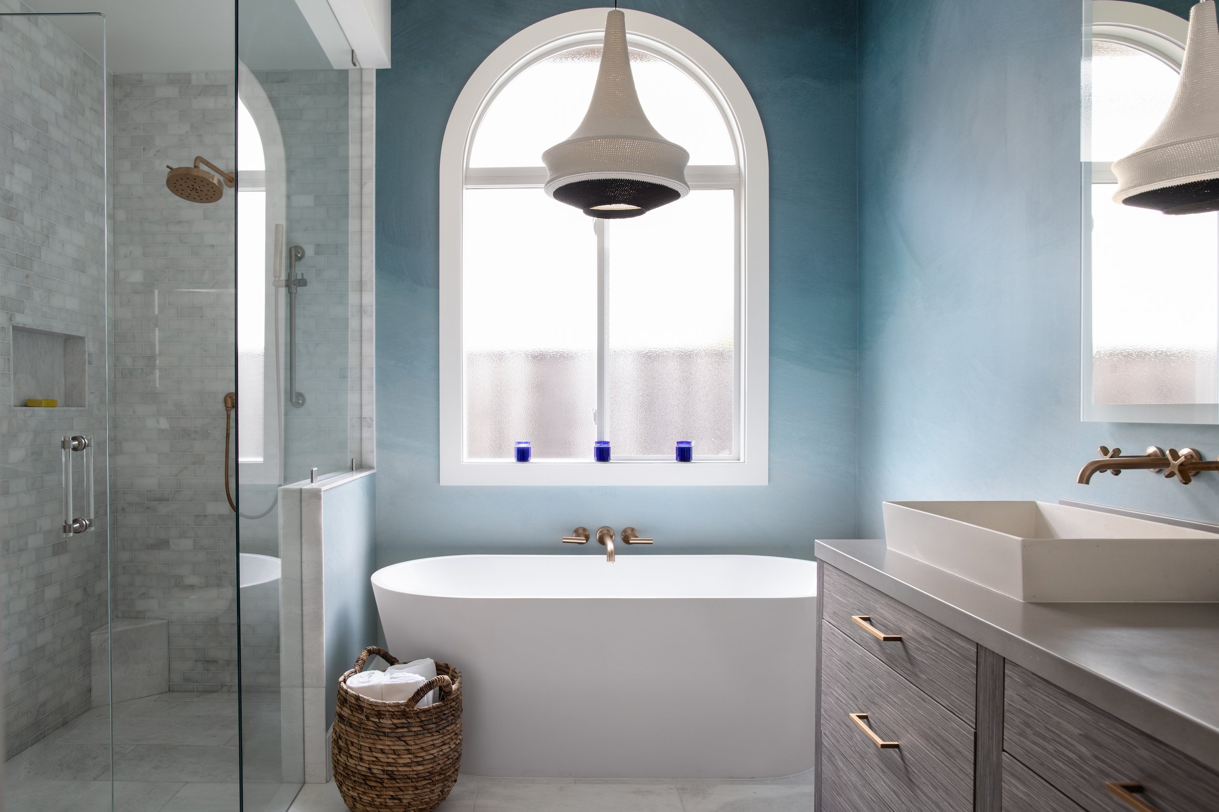
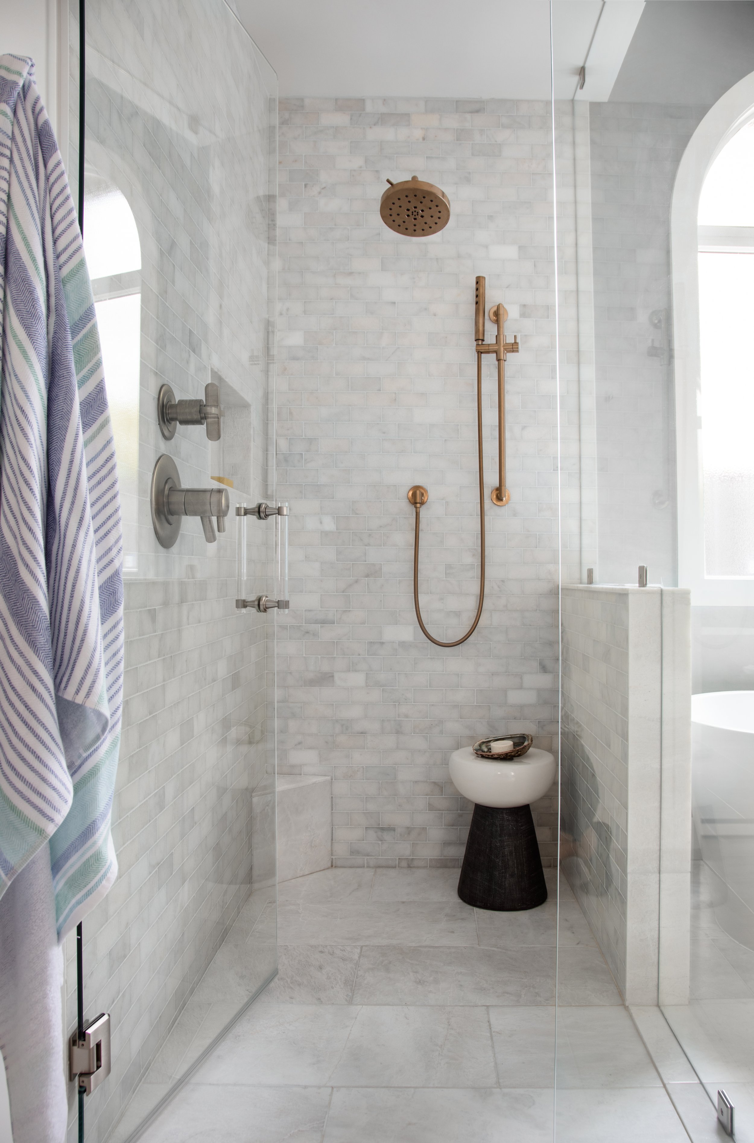
For the last phase of this home renovation, we tackled the master bathroom, which was a total gut job. The goal here was to create a classic and sophisticated space with a luxury home spa feel.
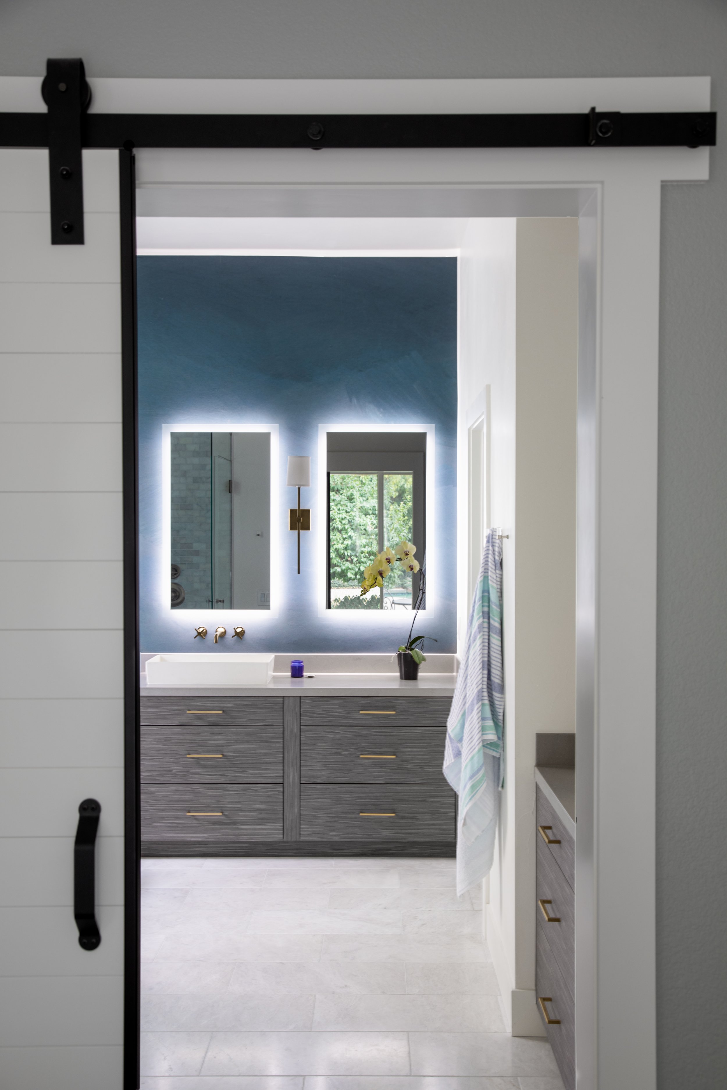
We created a beautiful accent wall with hand-painted blue ombre wallpaper by Anewall. The marble floor and shower tile make the space feel elevated and elegant. The Treefrog custom vanities add warmth to the space, offering the perfect balance of style and function. The modern brass Kohler fixtures add a touch of bling, while the crochet pendant light over the tub by Hamimi Design adds some texture and boho flare.
After: The Finished Space
Once everything was complete, our clients couldn’t be happier. They had lived through months of construction, moving most of their essentials to the garage, and now they had a beautiful new home to enjoy. (Especially during COVID lockdown when everyone needed to be home much more often).
The kitchen and living spaces are bright and open. The kitchen is not only beautiful but the perfect space as the hub of the home. The entire family can extend across all three main spaces and still feel connected, while the family room has the option to be closed off to create a more cozy or private space when needed.
The Master bathroom is the perfect zen space for the homeowners to rest after a long day, while the Master bathroom is a much-needed luxury space for self-care. The guest bath has its own character personality but still coordinates with the rest of the home.
While these clients were naturally apprehensive about taking on such a big renovation project, the final results are better than what they imagined, allowing them to fall in love with their home all over again. In the end, we created the perfect balance of functionality and design. While all the custom elements we incorporated make the space feel perfectly tailored to the client's needs. They now have a stunning family-friendly home where they can continue to build memories together.
Want to see the the rest of the Open & Airy project photos? Click to our Portfolio page below!
Are you in the Sacramento Metro area and plan to start a home renovation project? But want a skilled interior designer to take the stress off your plate? Then KED can help! As an experienced full-service interior design firm, we’re experts when it comes to designing both beautiful and functional spaces. Contact us today to get started.
