Building Dream Homes: How KED and MT Higgins Construction Create Luxury Spaces
Meet our construction partner, MT Higgins Construction, and discover how our seamless collaboration brings luxury home designs to life with expert craftsmanship.
Why the right interior design and contractor team matters
A successful home renovation or new build isn’t just about the final result—it’s about the process. At KED, we believe that careful planning, innovative design, and attentive client service are foundational to creating exceptional homes. Additionally, a strong collaboration between the interior designer and contractor can make all the difference in achieving a well-executed project. For our projects, we’re proud to partner with MT Higgins Construction, one of California’s premier general contractors, to ensure a seamless, high-end experience from concept to completion.
This month on the blog, we sat down with Michael Higgins, founder of MT Higgins Construction, and Kristen Fiore to discuss their working relationship, their recent modern home project, and the key insights every homeowner should know before embarking on a home construction journey.
Designed by Kristen Elizabeth Design, Constructed by MT Higgins
The Power of a Strong Design & Build Partnership
What makes your partnership work well?
Kristen: Communication is the cornerstone of a good working relationship. Michael and his team do a great job keeping everyone in the loop, including the clients and the design team. MTH consults us on decisions large and small and we appreciate their attention to detail, their trust in our expertise, and their respect for our designs.
While we run different businesses at the end of the day, we are all on the same team. Our shared goal is a successful project and happy clients. Things happen in remodels that require patience, professionalism, and problem-solving, and we work together to find the best solutions.
Michael: We believe that a well-laid plan sets the foundation for a successful project. From the start, we align with KED to ensure all design elements are accounted for, which helps avoid delays and unexpected costs. Our team prioritizes open communication and transparency to ensure the client's vision is realized with precision and efficiency.
A Modern Home Transformation
You recently partnered on a stunning modern home project, tell us a little about the project and how you collaborated to bring it to life.
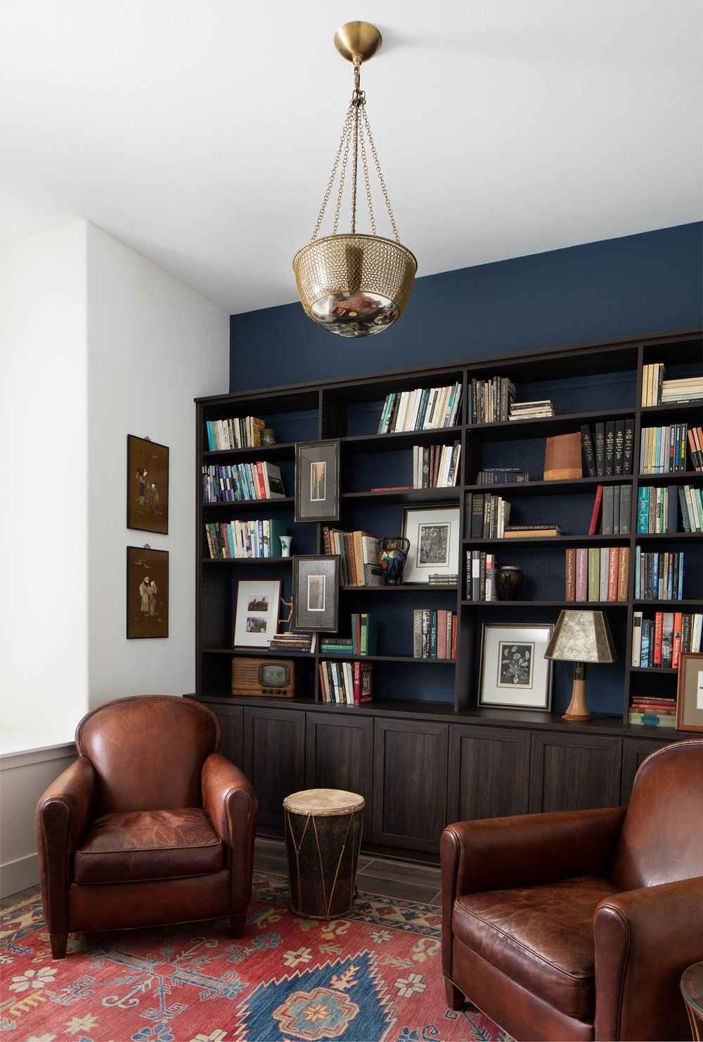
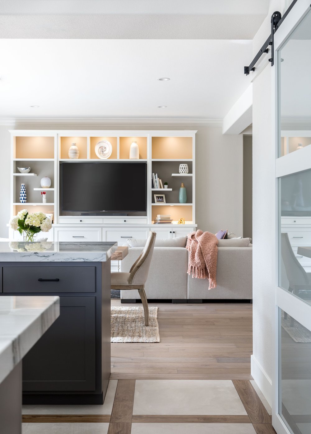
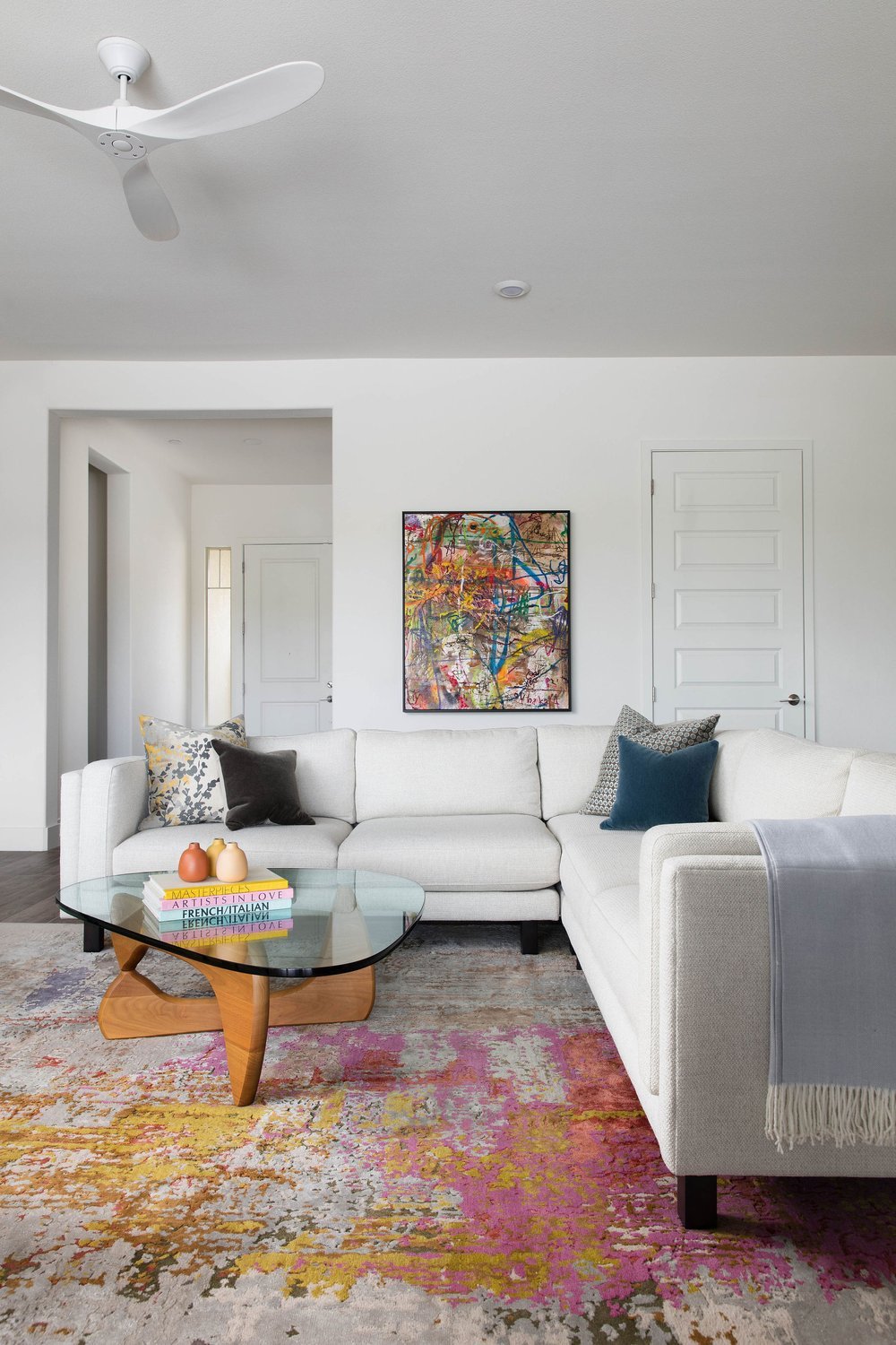
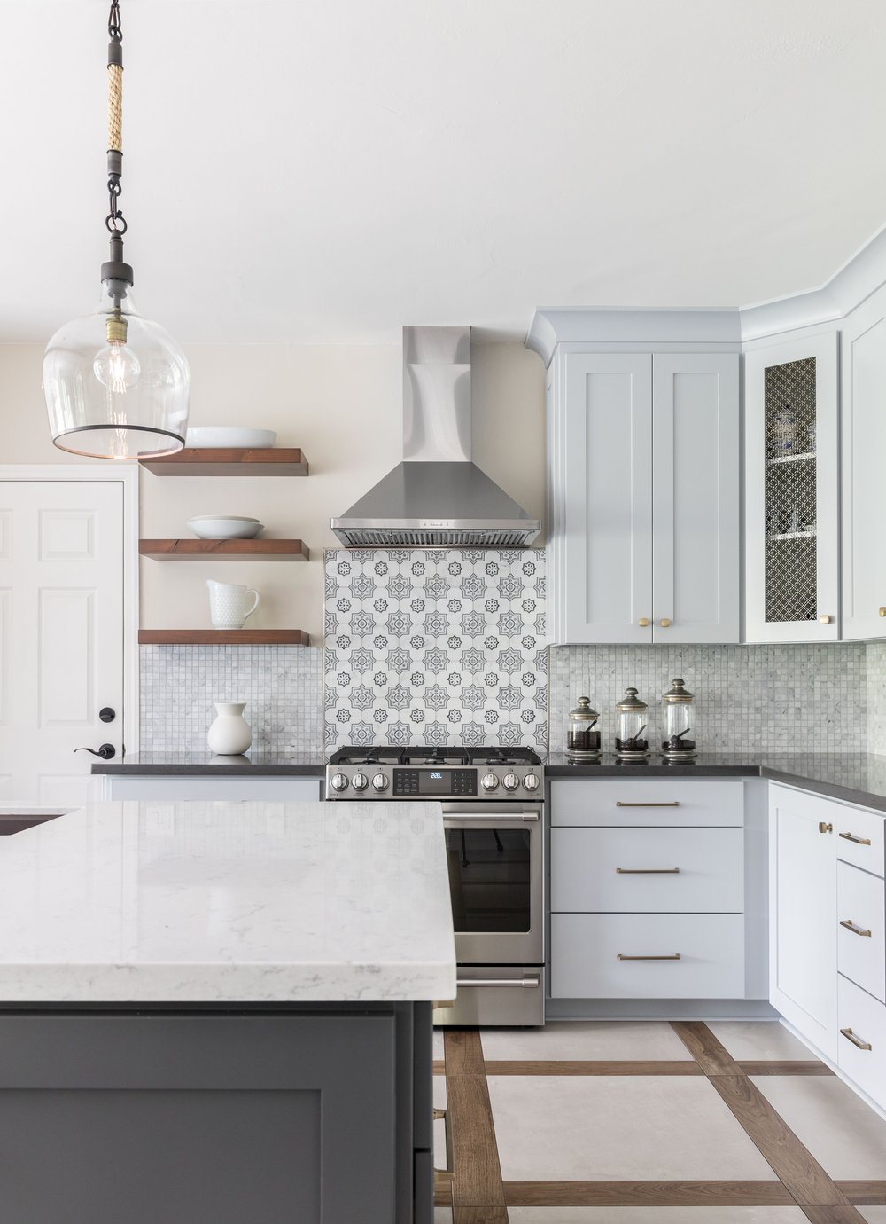
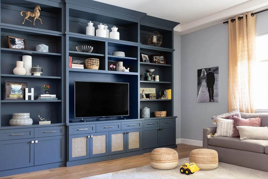
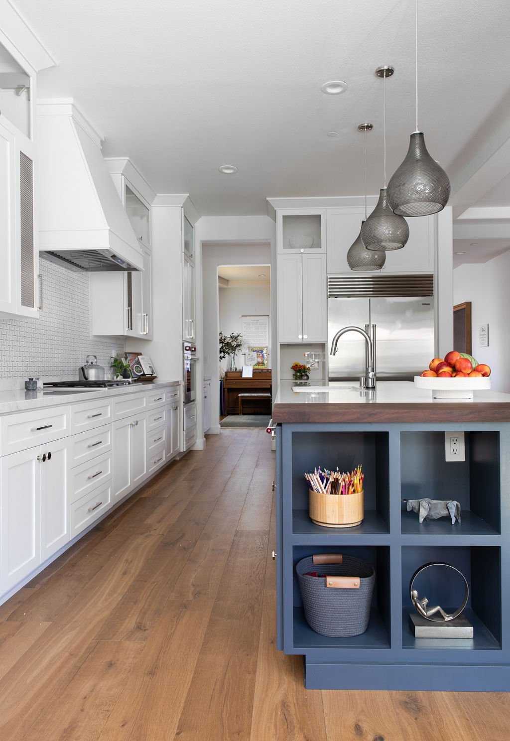
Kristen: Our clients in Loomis, CA, came to us to renovate their new home. Though the property was newly built, it lacked originality. Our clients wanted the home to feel like them—reflecting their style and personality. Our job was to create original, one-of-a-kind spaces that elevated the entire home.
We brought in MTH at the outset, knowing we wanted to work with a crew fluent in high-end design projects. The MTH team is open to new materials and ideas, values their craft, and keeps clients informed every step of the way.
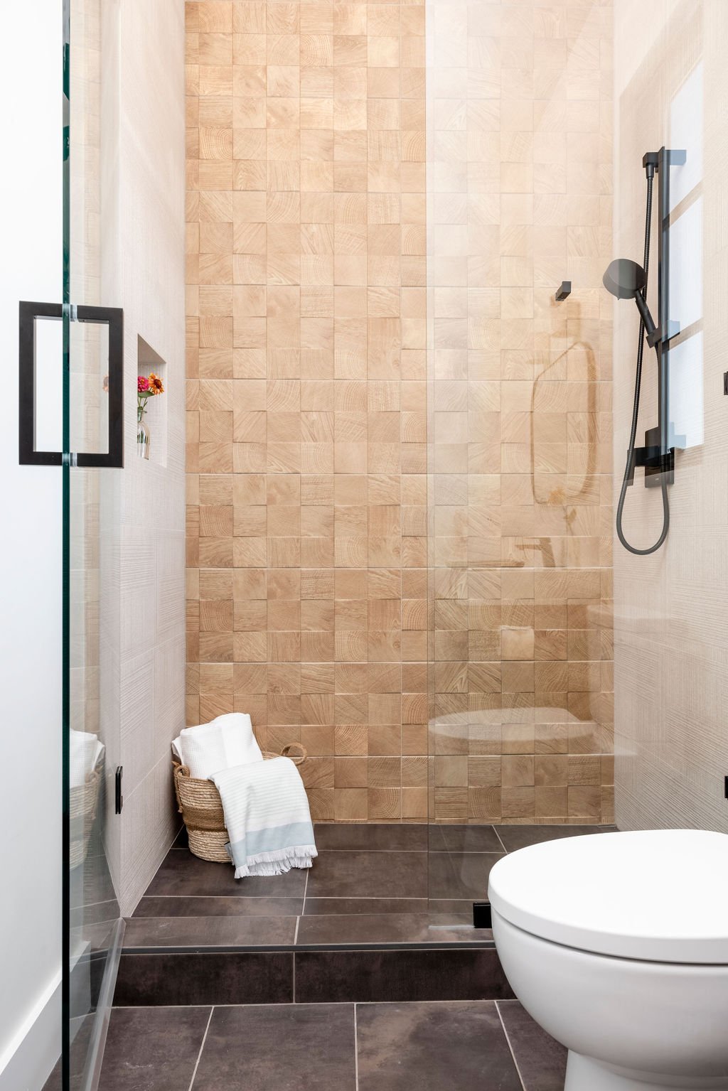
The entire home was customized with sophisticated materials and design concepts. One showstopping element is a backlit, three-dimensional feature wall in the Primary Suite. This highly technical design required troubleshooting to execute correctly, and MTH worked through solutions to ensure it was visually stunning and cost-effective.
Another challenge we ran into was finding artisans who could create custom 100-inch-high inset glass doors for the Primary Living Room. MTH found the right team, ensuring every detail was executed flawlessly. We also appreciated their openness to reusing materials, like the pick onyx quartzite we repurposed as a countertop and feature wall in the Arcade/Game Room. The result was a beautiful, one-of-a-kind space that married sustainability with luxury.
This project exemplifies how thoughtful planning and a skilled team can successfully execute ambitious design ideas—seamlessly blending innovation, sustainability, and craftsmanship.
Michael: Transforming a design vision into reality is what we love most about our work. This project was a great example of how collaboration between design and construction leads to amazing results. Our role was to bring KED’s original creative vision to life while ensuring practicality and structural integrity. We embrace challenges like custom elements and unique materials because we believe in making every home as special as the people who live in it.
Designed by Kristen Elizabeth Design, Constructed by MT Higgins
What Every Homeowner Should Know Before Building or Renovating
What should clients know before starting a home construction project?
Michael: If the client can be aware of a few key things in advance it helps the whole project run more smoothly. This includes having a clear understanding of the project timeline and schedule, confirming finishes early in the process, and prioritizing communication. When all parties are on the same page, projects move much more efficiently.
What common challenges do you face, and how do you handle them?
Michael: The biggest challenge is often a lack of planning before construction starts. We always encourage clients to invest time in detailed architectural plans and work with an interior design team. This allows for a more accurate budget, prevents ordering delays, and ensures that every design element is accounted for before construction begins. This is where working with a skilled interior design team, like KED has been an invaluable part of the process.
What’s the most common misconception you find in your industry?
Michael: One major misconception is that contractors often cut corners to save time and money. While that’s a common stereotype, in reality, quality craftsmanship is key to a successful project, most builders prioritize integrity, ensuring that every detail is up to code and industry standards. Education and open dialogue can dispel these myths and help build trust in our industry.
Designed by Kristen Elizabeth Design, Constructed by MT Higgins
The Passion Behind the Craft
Share a little about your story and how you got to where you are today.
Michael: I come from a long line of builders—my father was a builder, and my grandfather was a stone mason in Ireland. After working as a carpenter and project manager, I moved to San Francisco, where I worked on some of the most beautiful luxury homes in the Bay Area. Eventually, I launched my own company, and every project continues to be an exciting new challenge.
What do you love most about your job and what makes you great at what you do?
Michael: I genuinely love what I do. I don’t think everyone can say that and I feel very grateful that I can.
The best advice I ever received was to listen more than you speak. This simple insight has helped me understand my clients' needs, build great relationships, and ultimately create homes that truly reflect their aspirations. Listening opens doors to endless possibilities.
Our core values help me and my team produce great work. Craftsmanship, integrity, and a love for bringing dream homes to life are at the heart of everything we do. I prioritize clear and open communication, take a detailed approach to planning, and foster collaboration with our clients and partners. This allows us to build lasting relationships with clients, architects, and designers, ensuring that every project is completed with the highest standards of quality and care.
When you’re not working, what do you like to do?
Michael: I cherish moments with my wife Brianne and our golden retriever Fran, whether we are playing fetch in the backyard or exploring the great outdoors, our time together is priceless. I also love hitting the golf course at Del Paso Country Club or soaking up the beauty of the mountains and coast. Nature fuels my creativity and refreshes my spirit.
Designed by Kristen Elizabeth Design, Constructed by MT Higgins
Bringing Your Dream Home to Life
Our collaboration with MT Higgins Construction shows that the best projects come from strong partnerships. At KED, our expertise in luxury interior design, combined with our dedication to superior client service, ensures that we not only meet but exceed expectations. We are committed to delivering personalized, high-quality designs that reflect our clients' unique visions and lifestyles.
If you’re considering a home renovation or new construction project, partnering with a skilled design and build team like ours guarantees a seamless, rewarding experience. Contact us today to embark on your journey to a dream home that epitomizes luxury and sophistication.
Ready to get started? Contact us today to discuss your unique project goals and needs.
Make your home your favorite place to be.
Investing in a New Home? How to Build a Fire-Resistant House in California
Building a home in California? Protect it from wildfires with fire-resistant roofing, insulation, and construction materials that enhance safety and durability.
Materials, construction, and design techniques to withstand wildfires
The recent wildfires in LA County have been among the most devastating in the state’s history. Over 16,000 structures—homes, schools, businesses, and beloved neighborhoods—have been lost or severely damaged (Cal Matters). Our hearts go out to the communities that have been rocked to the core and to those who have lost everything. The scale of destruction is hard to fathom.
With wildfires becoming more frequent and intense, fire-proofing your home with fire-resistant construction is more important than ever—especially for those in high-risk areas. In this guide, we'll explore essential materials and construction techniques that can help safeguard your home against wildfires. We’re also sharing ways you can support those affected by the fires. By implementing these strategies, you can make informed decisions, enhance your home’s resilience, protect your investment, and gain peace of mind.
Designed by Kristen Elizabeth Design, Photographed by Kat Alves
Why Build a Fire-Resistant Home?
Wildfires can be unpredictable and fast-moving. A fire-resistant home offers more than just protection—it provides long-term security and financial advantages.
Safety and Security
A fire-ready home significantly reduces the risk of destruction, protecting your family, belongings, and property in the face of extreme conditions.
Cost Savings
Homes built with fire-resistant materials often qualify for lower insurance premiums, leading to substantial long-term savings (NHC Insurance Services). Additionally, these homes are less likely to suffer extensive damage, reducing costly repairs and replacements. Over the next 30 years, it’s estimated insurance costs will increase by 25% nationally with increases up to 90% in areas affected by extreme weather (Fast Company). Due to these cost increases, investing in a fire-resistant home will pay off in the long run.
Increased Property Value
Fire-ready homes are highly desirable in wildfire-prone regions. Whether you plan to sell or stay, investing in fire-resistant construction enhances your property’s value making it a wise investment.
Fire-Resistant Home Construction
Now that you have an understanding of the key benefits, let's dive into fire-ready construction. Fire-resistant homes are designed to withstand extreme heat, flying embers, and radiant heat exposure. Key construction features include:
Non-combustible or fire-retardant materials for framing, siding, roofing, and insulation.
Defensible space planning to keep flammable vegetation away from the home.
Fire-resistant windows and doors that prevent flames from penetrating the structure.
Designed by Kristen Elizabeth Design, Photographed by Rikki Snyder
Fire-Resistant Building Materials
With these features in mind, let’s review the essential materials and design strategies that make a home fire-resistant. Selecting the right materials is critical, here are some of the top options for framing, siding, and roofing:
Insulated Concrete Forms (ICF)
ICF construction, an alternative to traditional wood framing, involves interlocking foam blocks filled with concrete, creating a strong, well-insulated structure. These walls withstand extreme heat while offering excellent energy efficiency—a smart choice for fire-prone areas. Unlike wood framing, ICF homes resist combustion and have a higher chance of withstanding direct exposure to flames (ICF Specialist).
Mass Timber
Unlike traditional wood framing, mass timber is thick and dense, naturally resisting fire. When exposed to flames, it chars on the outside while maintaining structural integrity. This protective charring slows combustion, making it a more fire-resistant option than conventional lumber. In addition to its resilience, mass timber is also a sustainable option and more cost-efficient than concrete (Think Wood).
Thermally Modified Wood Siding
This sustainable wood undergoes a heat treatment process, improving its durability and fire resistance. The process changes the wood’s cellular structure, making it more resistant to ignition and decay. It also adds a rich, deep color to your home’s exterior while requiring minimal maintenance over time (Arbor Wood Co.).
Concrete & Stucco
Both concrete and stucco are non-combustible, offering excellent fire resistance. Concrete, whether used for walls, foundations, or patios, can withstand extreme heat. It has the highest fire resistance of any material. Stucco, when applied in multiple layers, creates a durable fire-resistant barrier, making it an ideal siding material in wildfire-prone regions (How Stuff Works).
Fire-Resistant Roofing
A fire-resistant roof is essential to prevent embers from igniting your home. Select a material with a Class A rating, this means it has the highest resistance to fire (All American Roofing). The best options include:
Metal Roofing – Highly durable, heat-resistant, and impervious to embers, metal panels reflect heat and do not ignite, offering one of the best defenses against wildfires.
Clay or Concrete Tiles – Naturally fire-resistant and long-lasting, these materials provide excellent insulation while adding a timeless look to your home.
Slate Roofing – Non-combustible and visually appealing, slate tiles can withstand high temperatures and extreme weather conditions.
Synthetic Roofing Shingles – Designed for fire resistance while mimicking traditional aesthetics, synthetic options are treated with fire-retardant chemicals to meet Class A standards.
Asphalt Shingles – Though not as fire-resistant as metal or tile, specially treated asphalt shingles can provide adequate protection when combined with fire-resistant underlayment.
No matter which material you choose, proper installation and regular maintenance—such as clearing debris from gutters and roofs—are essential to maximizing fire resistance.
Fire-Resistant Insulation
Choosing the right insulation can prevent the spread of fire within walls and attics (Prodex Total Insulation). The best fire-safe insulation materials include:
Mineral Wool – Naturally fire-resistant, mineral wool is able to withstand extremely high temperatures without melting or releasing toxic fumes.
Spray Foam – When treated with fire retardants, spray foam can provide insulation while helping to prevent fire from spreading through cracks and gaps.
Cellulose – A recycled paper-based insulation treated with fire retardants, cellulose slows combustion and limits flame spread.
It’s important to note, that while no insulation is entirely fireproof, selecting fire-resistant materials adds an extra layer of protection improving the overall safety of your home.
Designed by Kristen Elizabeth Design, Photographed by Stephanie Russo
Home Design Considerations for Fire Safety
Beyond fire-resistant construction materials, home design strategies play a crucial role in fire prevention.
Create Defensible Space
Create a protective zone around your home by clearing flammable vegetation and using non-combustible materials for pathways, fences, and decks. This buffer slows fire spread and reduces risk.
Keep Fire Risks Detached
Flammable materials—such as vehicles, stored paint, and firewood—should be kept in detached structures, away from the main house. Wooden fences should include a fire-resistant masonry break between the fence and the house. Wooden stairs or decks should be made with fire-resistant materials or fire-treated wood.
Fire-Resistant Landscaping
Choose plants with high moisture content that resist ignition. Keep vegetation well-trimmed and avoid trees or shrubs near the home that could act as a fire ladder.
Fire-Resistant Windows and Doors
Install double-glazed, tempered glass windows that withstand high heat. Fire-rated doors with proper sealing prevent embers from entering. Avoid acrylic skylights, which can melt and leave openings in your roof. Instead, opt for tempered glass skylights, which can better withstand high temperatures.
Screen Entry Points
Use wire mesh on vents, chimneys, and other entry points to block embers while allowing airflow. Ensure that the mesh material is non-combustible and corrosion-resistant.
Kristen Elizabeth Design
Consult Professionals
California's building codes evolve to address wildfire risks. Working with experienced professionals ensures compliance while achieving your design goals.
At KED, we have experience in fire-resistant home design. Our expert network of contractors understands the latest fire-resistant construction methods and will help you create a safe and stylish home that meets local safety standards.
Looking to Help Those Affected by Recent LA Wildfires?
Though the flames have been extinguished, the recovery process is far from over. Many families and communities still need critical support. If you’re looking for ways to help, consider donating to these organizations providing relief:
California Fire Foundation Wildfire & Disaster Relief Fund – Works with community-based organizations and local fire agencies to provide financial assistance to residents impacted by the fires.
Los Angeles Regional Food Bank – Partners with government agencies and nonprofit organizations to distribute food and essentials to those displaced by the wildfires.
Mercy Chefs – A nonprofit specializing in disaster relief, providing meals to wildfire victims, firefighters, first responders, and volunteers.
ASPCA Los Angeles – Offers disaster relief services, including animal search and rescue, emergency sheltering, relocation, and supply distribution for pets affected by the fires.
Rebuilding will take time, and ongoing support is crucial. Every contribution—big or small—can make a difference.
Final Thoughts
As wildfires continue to pose a growing threat, building a fire-ready home is more important than ever. By selecting fire-resistant materials like mass timber and metal roofing, you can protect your loved ones, save money, and increase your property’s value.
Wildfires are unpredictable—but your home's safety doesn't have to be. Contact us today to build a fire-resistant, stylish, and sustainable home that meets California’s latest safety standards.
Ready to get started? Contact us today to discuss your unique project goals and needs.
Make your home your favorite place to be.
Your Home, Elevated—Professional Interior Design in Just One Day
Elevate your home in just one day with Kristen Elizabeth Design's Designer for a Day service. Expert advice, custom solutions, and timeless results.
Discover how our designer for a day service brings your vision to life.
Imagine a day dedicated to elevating your home with the guidance of a professional interior designer. That’s the magic of our Designer for a Day service—a focused, hands-on collaboration where you receive expert advice, curated solutions, and a clear plan to move your design dreams forward.
Whether you’re searching for the perfect paint color, a thoughtful layout, or a curated furnishings plan, this service offers professional results without the commitment of a full-scale project. Its design made simple, accessible, and beautifully tailored to your needs.
Designed by Kristen Elizabeth Design, Photographed by Stephanie Russo
Who Is Designer for a Day For?
Have you been scrolling through inspiration boards and collecting ideas, but need help to bring them to life? Or maybe you have a vision but need a professional to fill in the gaps and provide clarity. If this sounds familiar, Designer for a Day might be the perfect fit.
This service is ideal if you:
Have a single room you need to style or refresh
Want to manage your home design project but need expert input to get started.
Feel overwhelmed by endless options and need guidance to narrow them down.
Need help solving specific design challenges, like space planning or selecting finishes.
It’s a partnership that empowers you to take control of your project, equipped with the insights and resources to make confident decisions.
Designed by Kristen Elizabeth Design, Photographed by Ellen Vanessa Photography
What Makes Designer for a Day Unique?
At Kristen Elizabeth Design, we understand that every home, every client, and every vision is different. That’s why our Designer for a Day service is structured to be comprehensive and flexible, offering you a truly personalized experience.
This isn’t just another design consultation—it’s a transformative experience that gives you clarity, confidence, and results. Here’s what you’ll love about Designer for a Day:
Save Time: Don’t waste hours sorting through endless options online or wandering through showrooms. We’ll handle the research and present you with the best options tailored to your style and space.
Save Money: Through access to exclusive designer products and vendors, we’ll secure better-than-retail pricing. Plus, you’ll avoid the costly mistakes from trial-and-error decorating.
Peace of Mind: No more second-guessing or wondering if things will come together. We create cohesive, timeless designs to fit your unique style and the functionality of your space, leaving you confident in every decision.
Hands-On Support: You’ll have our undivided attention and expertise for the time we are together. We’ll walk you through your prioritized needs, from fine-tuning your design vision to addressing tricky details, so you feel supported and in control.
A Streamlined Path Forward: By the end of the day, you’ll have more than just ideas—you’ll have a clear, actionable plan to bring your vision to life. With thoughtfully curated recommendations, we save you the stress of figuring out the next steps on your own.
For single-room updates, Designer for a Day is the perfect way to infuse your home design project with professional guidance.
Designed by Kristen Elizabeth Design, Photographed by Stephanie Russo
How Does Designer for a Day Work?
So, how does the Designer for A Day service work anyway? From our initial preparations to the on-site session and follow-up, we’ve crafted a process that ensures every moment is purposeful and designed around your needs.
Before We Meet: Setting the Stage
Preparation is key to making our time together impactful. Once you book your session, we’ll ask you to complete a questionnaire about your goals, style preferences, and the challenges you’re facing. If you have photos of your space or an inspirational Pinterest board, even better—these visuals help us craft a design plan that aligns with your vision.
With this information in hand, we’ll refine the experience. Though each session is unique, before we meet, we’ll prepare by considering the following as needed:
Review of photographs of your space.
Request measurements.
1-hour Zoom meeting to review style, budget, and space requirements.
Review your inspiration, priorities, and budget.
Draft initial layouts and space plans.
Source options for furnishings, paint colors, and décor from trusted vendors.
Your design needs are considered to ensure our time together is productive and focused. By the time we meet, we’ll have a clear plan to make the most of our time together.
The On-Site Session: Where the Magic Happens
Our three-hour in-home session is all about collaboration. We’ll dive into the specifics of your space, answer your questions, and refine your ideas. Here's what we’ll cover:
A Design Deck review focusing on your needs and priorities. Guidance on honing your design style.
Samples, tear sheets, and other relevant ideas for collaboration.
Recommendations for paint colors, furnishings, and layouts.
Curated product options to suit your style and priorities.
This time is yours, so ask questions, share concerns, and explore possibilities. Together, we’ll create a plan that feels cohesive and achievable.
After the Day: Bringing It All Together
Once our session ends, we continue working behind the scenes to finalize your design plan. Depending on your needs this may include things like:
Organizing and presenting your approved selections.
Creating purchasing or material-specific schedules.
Handling purchasing and expediting to streamline your experience.
Within days, you’ll receive a revised and detailed design presentation, complete with everything you need to execute your project.
Designed by Kristen Elizabeth Design, Photographed by Kat Alves
Want More? Enhance Your Experience
For homeowners ready to take their project to the next level, we offer personalized add-ons to complement your Designer for a Day service:
Window Treatments: From measuring and fabric selection to installation, we’ll handle it all.
Custom Built-Ins: Elevation drawings, finishes, and cabinetmaker collaboration for a flawless look.
Bespoke Bedding: Layer your bed with expertly chosen linens and textiles.
Project Management: Let us oversee the details to ensure every element is executed beautifully.
After our initial meeting, we ask that you confirm any add-ons to ensure those details are addressed. These additional services provide even greater customization and ease, giving you peace of mind every step of the way.
Kristen Elizabeth Design
The KED Difference
At Kristen Elizabeth Design, we believe that design should feel effortless and approachable. With Designer for a Day, we bring the same thoughtful, detail-oriented approach that defines all our services, customizing the experience to fit your unique needs.
This is more than just a consultation—it’s an empowering, collaborative experience that leaves you inspired, informed, and ready to create a home you love.
Your dream home awaits! Book your session today and let's create something beautiful together.
Ready to get started? Contact us today to discuss your unique project goals and needs.
Make your home your favorite place to be.
The KED Holiday Gift Guide: The Ultimate Stylish Shopping Destination
Discover the ultimate holiday gift guide from Kristen Elizabeth Design, featuring stylish, thoughtful gifts for every personality on your list this season.
Beautiful holiday gifts for everyone on your list
The holiday season is upon us, bringing with it the joy of giving and gathering with loved ones. At Kristen Elizabeth Design, we believe that the best gifts are those that speak to the recipient’s unique passions, adding elegance and thoughtfulness to their daily lives. That’s why we’ve curated a special holiday gift guide to make your holiday shopping a breeze. From culinary essentials for the home chef to cozy touches for the ultimate homebody, each item in this guide has been carefully chosen to elevate the holiday experience. Browse through our handpicked selections to find something beautiful, useful, and meaningful for everyone on your list.
Gifts for the Home Chef
For the loved one who finds joy in the kitchen, these gift picks will make their culinary adventures even more delightful. Whether they’re a seasoned chef or a passionate foodie, this curated collection combines elegance and utility, turning every meal prep into an experience.
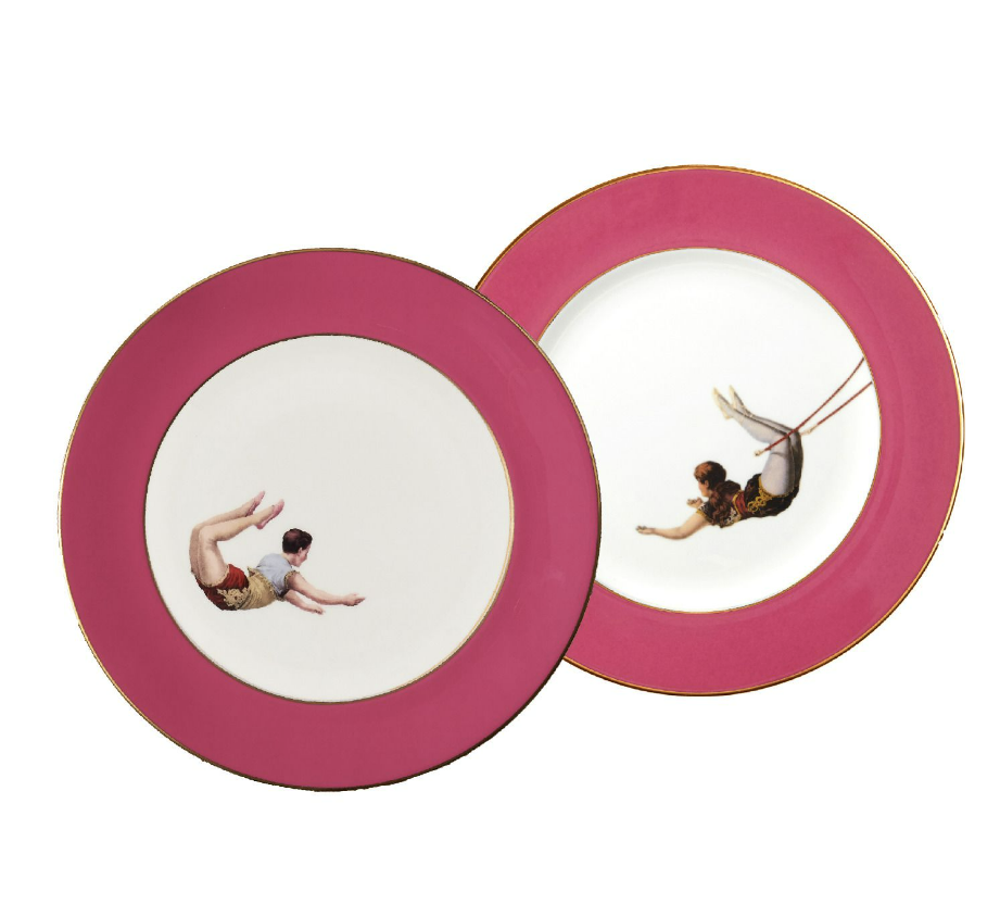
Start with the stunning Vintage Blue Skull Dinner Plates or Raspberry Pink Trapeze Plates from Melody Rose London—each piece adds a touch of whimsy to the table, perfect for cooks who appreciate bold, artistic tableware. The Staub Round Cocotte from Williams-Sonoma is a kitchen must-have—we love it in Citron! This commercial-grade Dutch oven offers the best of both worlds with superior functionality and vibrant style.
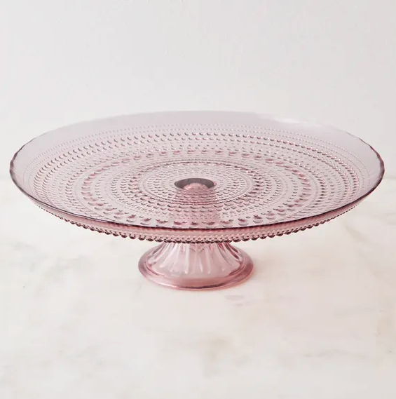
For the bakers on your list, the beautiful Mosser Colored Glass Cake Stand by Mosser Glass or the vintage-inspired Jupiter Hobnail Cake Plate by Fortessa Tableware Solutions, ensures their delectable creations have a stylish showcase. Protect their wardrobe with the Waxman Apron from Hedley & Bennett, blending durability with style. For morning routines or brunch prep, the convenient multifunctional Bear Egg Cooker is a handy addition. Round it out with the Contemporary Cookbooks Set from Juniper Books—a chic and comprehensive collection that will inspire them with fresh recipes and cooking techniques.
Gifts for the Bookworm
For those who love getting lost in a good book, here’s a collection that enhances their reading sanctuary. From beautiful accessories to useful reading aids, these thoughtful gifts are ideal for book lovers who value both form and function.
The Author Clock from the MoMA Design Store is a one-of-a-kind gift that brings literature to life, displaying the time through famous literary quotes. Complement this unique timepiece with the Reading Valet from Uncommon Goods—a stylish and practical piece that holds books, reading glasses, your phone, and even a mug for the perfect cozy setup. They’ll also love the sleek Brass Book Display Stand from CB2, an elegant way to showcase their favorite reads or perfect for holding a tablet or e-reader.
Help them make their mark with a personalized book embosser, like this one from PickledStampes on Etsy, adding a special touch to their beloved collection. Finally, the Cat and Bird Bookends from Maitland-Smith bring whimsy and elegance to any bookshelf, offering both style and support for their treasured reads.
Gifts for the Grill Master
For the outdoor cooking enthusiast, these gifts are designed to elevate grilling season. Each item in this selection supports flavorful creations and unforgettable gatherings around the grill.
Start with the KitchenAid Yummly Smart Thermometer, a tech-savvy tool that ensures perfectly cooked meat, poultry, and fish every time. Pair it with the stylish yet durable Lamson Premium Walnut Grill Tools, which include all the essentials for precision grilling. To bring even more flavor to their cookouts, the Grilling Favorites Gift Crate from Stonewall Kitchen is packed with premium sauces and rubs that complement everything from ribs to seafood.
For versatility, the Lodge Cast Iron Grill Basket allows them to grill vegetables, seafood, and other smaller items with ease. And, to cap off any gathering, the S’mores Anywhere Fire Roaster from Uncommon Goods lets them create s’mores on demand—a fun and nostalgic treat that adults and kids alike will love.
Gifts for the Serenity Seeker
Pamper the spa lover in your life with these indulgent self-care essentials, perfect for creating a relaxing retreat at home. These thoughtful selections will enhance their wellness routine, encouraging them to unwind and recharge.
The NuFACE Mini Starter Kit is perfect for anyone who wants to dip their toes into the NuFACE world, delivering facial toning benefits to help them look and feel rejuvenated. For a natural glow, the Earth Tones Mask by ASARAI revitalizes skin, while the Primally Pure Dry Brush promotes circulation and exfoliation for a spa experience right at home.
Keep them cozy with Shepherd of Sweden’s Jenny Slippers, made from plush sheepskin for ultimate comfort. The Organic Vetiver Candle by SKAR Organics brings a calming aroma to any room, and the Customizable Brass Match Case from Cupcakes & Cashmere adds a hint of elegance to their relaxation ritual.
Gifts for the Hostess
Perfect for those who love entertaining, this collection brings style and sparkle to holiday gatherings. These thoughtful gifts will help any hostess (or host) create a warm, welcoming atmosphere that guests won’t forget.
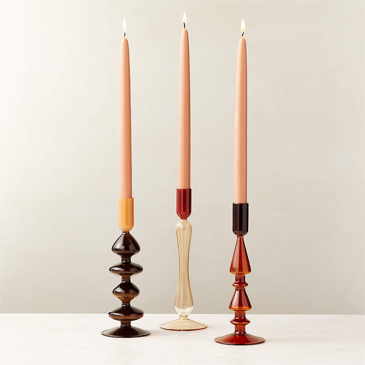
The Velvet Bow Crackers from Meri Meri add a playful, festive touch to their holiday dinner, while the Kava Glass Taper Candle Holders from CB2 bring depth and elegance with their modern shapes and rich tones. For a pop of color, Meri Meri’s Rainbow Table Candles bring a fun visual element to any spread, and Calypso Pink and Amber Wine Glasses by Serena Confalonieri offer a unique flair for toasting the season.
Last but not least, Cabana’s Balloton Water Glasses add sophistication to any gathering. Handblown from Venetian glass, they come in blue, amber, green, and pink to perfectly round out a beautifully set table.
Gifts for the Art Connoisseur
For the person who appreciates beauty in every form, this selection brings the gallery experience home. These artful items are perfect for curating a creative space that reflects their style.
The Fielding Clay Works Iron Horse is a fine art object that commands attention, sculpted to hold a candle, dried flowers, or stand-alone its timeless appeal will elevate any table or mantle. They’ll also appreciate the Painted Ceramic Fish Pitchers by Bordallo Pinheiro, adding a vintage charm to their decor.
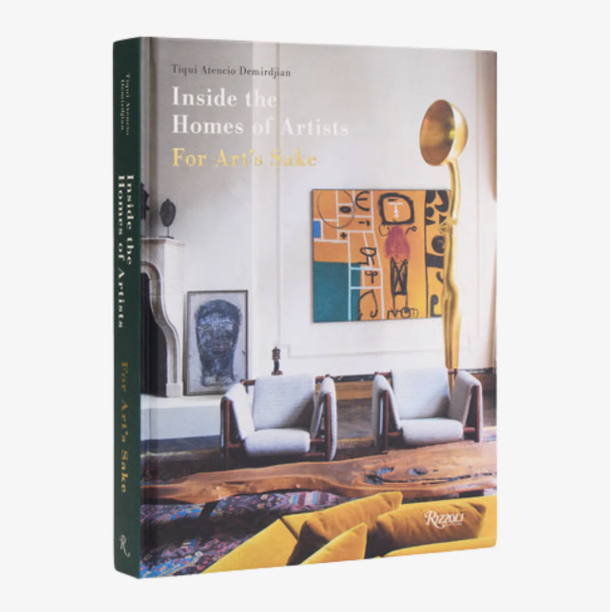
The Mondri Neon Vase from the MoMA Design Store is both functional and a statement piece, bringing a pop of modern art to spark conversations. For endless art inspiration, Inside the Homes of Artists For Art’s Sake by Tiqui Atencio Demirdjian and photographed by Jean-François Jaussaud offer a glimpse into the lives of iconic artists celebrating the curated spaces that inspire them.
Gifts for the Homebody
For those who live for cozy days at home, this selection brings warmth, comfort, and a touch of style to their space. These thoughtful pieces create a sanctuary that invites relaxation and serenity.
The Home Gift Set No. 09 from Maison Louis Marie includes luxuriously scented candles and sprays, perfect for filling their space with soothing aromas. The Rona Throw by Wallace Sewell instantly adds warmth and pairs perfectly with the Wollstonecraft Cushion to add style and comfort to any seating area.
For their favorite tea or coffee, the sweet Bowknot Coffee Mugs from Noon & Moon bring a whimsical touch to mornings and evenings alike—perfect for those who find joy in the simple comforts of home.
Gifts for the Style Icon
Celebrate the fashionista in your life with this curated selection of chic accessories and fashion-forward pieces.
The De Fleurs Silk Scarf by Artifact is a versatile accessory, perfect for dressing up any outfit with a beautiful floral print. For cozy nights, the Fable Floral Engravings Pajamas by Fable England offer both comfort and elegance. Pearls and crystal have never looked better than in the Faith Necklace by Regina Andrew—a modern piece with timeless appeal.
For extra warmth, Shepherd of Sweden’s Klinta Hat keeps them stylish during winter outings, while the Gaspard Cardigan from Sézane is a winter staple. The decorative porcelain Versace Alphabet Square Plate is perfect for holding jewelry or adding a pop of style to their vanity or dresser.
Wrapping Up
As you dive into holiday shopping, we hope this gift guide has helped spark ideas beyond the ordinary. The season is all about celebrating the people who make our lives brighter and finding a gift that truly resonates can be a memorable way to show you care. At Kristen Elizabeth Design, we’re passionate about infusing beauty and purpose into every space and every gift. Here’s to a holiday season filled with warmth, gratitude, and special moments shared with family and friends. Happy gifting!
Ready to get started? Contact us today to discuss your unique project goals and needs.
Make your home your favorite place to be.
Quiet Luxury: A Country Estate Transformation
Explore the quiet luxury of a Loomis home transformation. See how we blended timeless design with modern elegance. Read the full reveal for inspiration!
A harmonious blend of style, comfort, and sophistication
This month on the blog, we’re thrilled to share that our Calm and Collected project has been highlighted in AD Italia! A big thank you to the AD Italia team, we are honored to be included as a special feature. To give you a closer look, we’re diving into an in-depth before and after, so you can explore all the details behind this stunning project.
When a couple left the chaos of the Bay Area tech scene and relocated to a peaceful 5-acre Loomis countryside estate, they were drawn to the ample space, idyllic surroundings, and thoughtful layout. However, the aesthetic didn’t reflect their style. The house, a time capsule of the early 2000s, felt dark and dated in a French Country aesthetic. Our clients saw the strong bones and potential beneath the outdated features and were ready for a fresh start. Keep reading to discover how we transformed this home into a warm inviting, timeless California residence.
Before: Stuck in the Past
The home was in desperate need of an upgrade, with a design that belonged to a different era—remember when sponge-painted walls were trendy? The original build had potential, but the faux architectural elements and overwhelming dark palette took away from the beauty of the space. Large windows were hidden behind shutters and bulky drapery, blocking the natural light the home deserved. The homeowners wanted to brighten things up and create interiors that felt both fresh and timeless. Our goal was clear: breathe new life into the space while honoring the structure's strong bones.
Every room needed an update, from the entryway to the family room. While the layout remained intact, we knew that a full transformation, including a kitchen remodel and updating all surfaces, finishes, and furnishings throughout, was necessary to achieve the clean, classic look the clients desired.
The Transformation: Breathing New Life Into the Home
Updating a 6,500-square-foot home is no small task, but we embraced the challenge. In addition to overhauling the look and feel of the home, we also wanted to draw stunning views from the backyard inside. To accomplish this, we updated every room. With new cabinetry, flooring, lighting, furnishings, custom design elements, and fresh paint throughout, we transformed the home into a space that was truly reflective of our clients.
Taking inspiration from Quiet Luxury we used classic design principles and elevated materials to create an understated yet undeniably sophisticated home. We looked to the Arts and Crafts movement, particularly Mission style, and married it with a laid-back California vibe. Authenticity was key, so every material we used was chosen for its craftsmanship and timeless appeal.
The Entryway
The inviting entryway makes for a grand yet welcoming first impression, offering guests an immediate sense of luxury as they arrive. Using classic materials and shapes, we paired a custom mosaic marble mat with a mercury glass and chainmail pendant light overhead. The interplay of materials is subtle yet captivating.
The Kitchen
The kitchen was a complete overhaul. We updated cabinetry and surfaces to create a cohesive, functional design. Custom inset cabinetry includes a combination of traditional style doors, frosted glass fronts, and open shelving that gives the space a varied yet balanced and elevated look. The island is a showstopper, featuring a honed, bookmatched Calacatta Borghini Supreme slab that exudes elegance. We balanced this luxurious stone with playful barstools, adding a touch of casual fun. These elements combined with the quiet white Dolomite backsplash, Belgian-inspired terracotta floors, and custom range hood epitomize Quiet Luxury.
The breakfast nook includes a custom-designed built-in with a hidden laptop workstation—perfect for keeping tech out of sight when not in use. The industrial-style light fixture over the table by Hubbardton Forge brings an unexpected edge that elevates the room’s design.
The space is now the true heart of the home—a place where our clients can enjoy casual meals together or host friends for a weekend brunch.
The Living Room
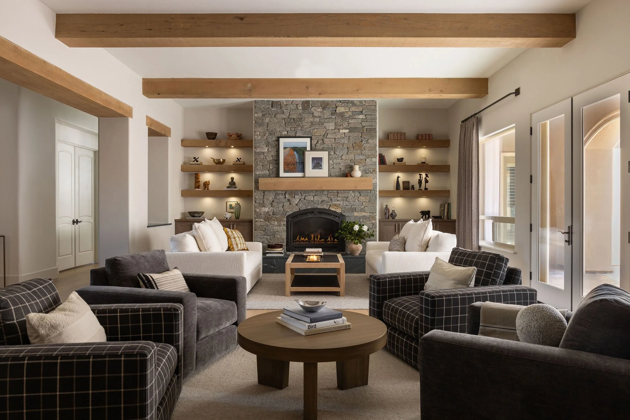
Off the kitchen is the living room, which presented an opportunity to blend comfort with sophistication. We refaced the fireplace in beautiful hand-cut Rocky Mountain granite, added custom white oak beams, and redesigned the millwork to showcase family collectibles and create a warm, inviting atmosphere.
With two seating areas, this room is ideal for conversation, free from the distraction of a television. Verellen sofas by the fireplace are some of the most comfortable pieces we’ve ever had the pleasure of sitting in. The custom white oak and steel coffee table by Douglas Allen Designs ties in with the wood and metal accents throughout the space.
For a personal touch, the built-ins were styled with our client's travel mementos—South African statuettes, an ostrich egg, and generational books, among other keepsakes. This serene and elegant space is perfect for entertaining guests, enjoying quiet evenings by the fire, sharing stories, or simply relaxing.
The Powder Room
Glamour meets elegance in the powder room. The room features a laser-cut marble wall, soft pink paint, blue diamond hand-painted terracotta floor tiles, and a luxurious Waterworks commode, all chosen to reflect the homeowner's elevated sense of design and create a space that is purely feminine.
This beautifully crafted space offers guests a charming yet luxurious experience, a small jewel box of personality within the home.
The Dining Room
A departure from the original paint design in the dining room turned out to be a happy accident. The painter mistakenly painted the whole room a rich plumb color—Amazon Soil by Benjamin Moore—leaving the room feeling like a cozy cocoon, wrapped in a deeper, richer hue than originally planned. We decided to keep it, forgoing the chair rail and lighter paint, which would have softened the effect. The Thos. Moser classic walnut table and mohair-covered seating in mossy green complement the drama of the rich walls. And like the breakfast nook, the pendant drop chandelier adds the perfect unexpected element of industrial edge yet sophistication to polish off the space.
The intimate setting is now the perfect backdrop for family dinners, holiday celebrations, and heartfelt conversations over a lovingly prepared meal.
The Primary Bedroom
In the primary bedroom, we embraced color, introducing grasscloth walls in Blue Violet Juicy Jute by Phillip Jeffries, and octagon terracotta tiles for the hearth of the newly refaced fireplace. The balance between vibrant and neutral elements brings a feeling of both relaxation and sophistication.
A luxurious Nathon Anthony bed, dressed in cozy textiles and playful patterned pillows, adds to the serene ambiance. This calming sanctuary is now a peaceful escape, where the couple can unwind at the end of the day, enveloped in understated luxury.
The Family Room
The last stage of the project included the family room, which has a sophisticated yet playful feel. The striped table by Global Views, paired with the green chenille Rowe and Robin Bruce Derby Sectional, brings an unexpected pop of personality.
This relaxed space serves as the home’s ultimate gathering spot, where loved ones can come together for fun and laughter or a quiet, cozy night in.
The Final Result
The completed home is a harmonious blend of quiet luxury, authentic materials, and personal style. We successfully merged the couple’s different design preferences, creating spaces they’ll love for years to come. In the end, this is more than an updated house—it’s a fully reimagined home, where every corner reflects the clients’ personalities. A place where they can relax, entertain, and create lasting memories.
Ready to get started? Contact us today to discuss your unique project goals and needs.
Make your home your favorite place to be.
KED’s Picks: 5 Fall Lifestyle Trends and Inspiration for Your Home
Explore fall's top lifestyle trends at KED, from Quiet Luxury and classic hues to bold color pops and cozy staples. Get inspired for the season ahead.
Fresh ideas to get you in the fall mood
As summer draws to a close, our thoughts are turning to the months ahead and the design possibilities they bring. Today on the blog, we're sharing sources of inspiration that are shaping our vision for the upcoming season. Fall is a time of transformation, and this year, we're excited about trends that combine classic sophistication with a touch of the unexpected.
If you're ready to embrace the beauty of fall in your home, read on to discover the trends we're loving this season.
Runway to Room: Elevate Your Spaces With Quiet Luxury
We're always attuned to the world of fashion because what's trending on the runway often finds its way into interior design as well. This season, it’s all about Quiet Luxury and we couldn't be more thrilled. Think deep, rich hues with timeless appeal and materials that exude understated elegance. We're particularly inspired by designers like Ulla Johnson, Alejandra Alonso Rojas, and Eckhaus Latta, featuring sophisticated yet livable collections highlighting browns, reds, and yellows.
To translate this into interior design, we're embracing tailored furnishings. Think custom pieces that have been crafted just for you, like reupholstering a classic sofa or armchair with modern textiles that are thick, soft, and luxurious to the touch. It's all about creating spaces that feel both cozy and sophisticated, perfect for the fall season.
Ulla Johnson
Fall Hues: Browns, Reds, and Yellows
This season, we're seeing a resurgence of chocolate browns and rich reds, colors that naturally evoke the warmth and comfort of fall. But we're also adding a burst of joy with yellow! Whether in textiles, millwork, or as an accent color, yellow brings a cheerful vibrancy that brightens any space.
To infuse the spirit of the season into your home with classic home staples check out CB2’s Fall Collection.
Unexpected Color: Embrace Non-Traditional Fall Hues
While traditional fall hues are always a safe bet, we're all about pushing the boundaries. For those who love a bit of contrast, consider pairing bright, unexpected colors with the classic tones of the season. Think raspberry and chartreuse or pops of cerulean blue. We love this bold living room by Nicola Harding. The vibrant blue walls pair well with the olive sofas, two colors you wouldn’t think work, complement each other so well.
If you’d like to incorporate color more subtly, try weaving pops of color into your home through smaller accents. Like a colorful Kitchen-Aid Mixer, a bright blue vase, or even corner stained glass accents for upper passageways.
One of our go-to brands for endless color inspiration is Mind the Gap. We admire their ability to blend bold designs with a timeless, classic appeal. Whether you’re looking for a daring accent piece or a statement wall covering you’ll find something beautiful, luxurious, and timeless.
Page.TheShop
Cozy Up: Fall Staples for Comfort and Style
As the days grow shorter and the nights cooler, it's time to indulge in some cozy essentials. Whether picking up a new Kindle case from Page, paired with an inviting throw blanket for those long reading sessions, or adding a scarf to your wardrobe (or even your home décor), the key is to surround yourself with things that make you feel warm and comfortable.
J. Mills Studio
Elevate Fall Classics: Add a Touch of Glam
Fall is also the perfect time to accessorize with statement jewelry. Non-traditional pieces with colorful jewels, especially in gold and chalcedony, are a go-to for us. For modern, handcrafted beautiful jewelry, we love J. Mills Studio and Dana Kellin.
Whether you like classic gold, silver, or prefer a splash of color, there's no better way to add a personal touch to your fall look.
Here’s to a Cozy Stylish Season
Fall is the perfect time to refresh your home with thoughtful, intentional design choices. Whether you're drawn to the understated elegance of Quiet Luxury, the warmth of classic fall hues, or the boldness of unexpected color combinations, there are countless ways to make your space feel both cozy and stylish.
At KED, we're inspired by the possibilities that fall brings. It's a time to play with textures, explore new color palettes, and layer in those inviting elements that make a house feel like a home. Whether you're looking to make a subtle change or a bold statement, we hope these trends inspire you to embrace the season with creativity and confidence.
If you're ready to turn your dream spaces into reality, we'd be honored to help. We’re just an email or a phone call away—we're here to make your vision come to life!
Ready to get started? Contact us today to discuss your unique project goals and needs.
Make your home your favorite place to be.
Interview with Kristen Fiore: Trends, Tips, and Timeless Design
Get inspired by Kristen Fiore's design journey, tips, and trends in this exclusive Q&A. Discover her sources of inspiration and timeless design advice.
Get to know the force behind Kristen Elizabeth Design
This month on the blog we’re sitting down with the talented and inspiring Kristen Fiore. Kristen's journey from growing up immersed in New York City’s vibrant art scene to taking night classes before founding her successful interior design firm in Sacramento is a testament to her passion and dedication to the craft. In this Q&A session, she talks about her path to success, sources of inspiration, the latest trends she's excited about, and those she’s ready to leave behind.
Whether you’re planning an interior design project or just curious about the process behind creating beautiful spaces, you don’t want to miss Kristen’s valuable insights and advice. Let's dive in!
Share your journey, how did you get to where you are today?
I have always had a flair for the creative. Growing up in New York, I would visit all the great museums on the weekends and I excelled in art at school but, never found a discipline that got me super excited. Until the day I discovered the Design and Decorative Building (D&D building) on the Upper East Side and fell in love. It took a long time before I knew this was my path. I went the traditional business route and was never quite fulfilled.
After moving to San Francisco, I found the Berkeley Extension Program for Interior Architecture and Design and enrolled in night classes. I loved it. But it took a little bit longer. After starting a family, I finally received a full degree with Honors for Interior Design and began Kristen Elizabeth Design in 2015.
It has been a journey of growth, learning, many highs, and a few lows. Every minute has been worth it. I and we as a company continue to evolve. I feel incredibly blessed to create such personal spaces for our clients, whom we get to know deeply, to work together and create rooms that bring them joy and happiness—spaces they love coming home to.
Kristen Elizabeth Design would not exist without our incredible team. I am very lucky to have two amazing women by my side. Nastassja Bowman, our very talented Interior Designer, and Jenifer McCool who keeps everything running smoothly! I learn something from them every day and am most grateful that they are by my side. We work hard, share a lot of laughs, and support each other daily and I can't forget to mention Courtney Fiki with Studio Cadette who oversaw the redesign of our brand and manages our socials. So smart and talented, she saves me from a side of the business that’s not my forte.
How do you find inspiration when starting a new design project?
I stay up on trending design and find out what's on the horizon by looking through good old-fashioned European magazines. They highlight so many different design styles and the evolution of those styles. You can't go wrong scouring the pages of AD Italia, House & Garden (the UK version of Home & Garden), or Elle Decoration (the UK version of Elle Decor).
I have also started a nice collection of designer books, from designers I emulate and aspire to. They offer great inspiration and are an education in themselves. They are the most invaluable resources I have. I’m endlessly inspired by Richard Mishaan, Victoria Hagan, and Axel Vervoordt. I can't wait to scroll through Bridget Romanek's new drop: “Liveable Lux”.
What design trend excites you most right now?
I'm excited for COLOR! I am loving the New Classic movement as well. The New Classic entails combining modern elements that are the perfect blend between elegance and artistry. When designing a New Classic style home, we get to mash up avant-garde materials and colors. We love the textures and patterns in fine textiles and the mix of calming colors and papers on the wall. It is totally my vibe and we do it really well! Our recent projects: Artful & Glamorous and Well Suited are great examples of this style executed in vastly different ways.
What design trend are you sick of?
I am tired of the oatmeal linen and white oak everything look. I am also ready for boucle fever to be over! Stop already. It's boucle all day and it needs some rest.
Before starting a home design project, what’s the most important thing clients should know?
I think there are a couple of things clients should be aware of before starting a project. The first is to create a budget. Our costs have risen so dramatically since COVID-19 that it helps to be realistic about affordability and to modify, if necessary, the overall scope of the project.
Next, understand that although we are here to make the process as seamless as possible and reduce stress; design and construction are always a process and a long process. It is a very human process. Things change, items go out of stock, something unexpected delays the timeline, or someone makes a mistake. These things happen, it’s just the nature of the beast. We are here to find solutions and move forward. We do this professionally and transparently. It is sometimes frustrating, but we work through it together, calmly and with educated decisions.
What’s the best piece of advice you’ve ever received?
Create a process for everything. Write it down, make adjustments, always strive to be better, and more efficient, and communicate clearly.
Hire people who are better than you at something.
Quadruple check everything and then, check it one last time.
What’s the most common misconception you find in your industry?
Time. Most clients think that designing a room or a home can be done in a timeline like on HGTV. Design takes time is my motto, and great design takes a little more time. Most don’t understand the level of detail that every decision requires. Research takes time, finding the right vendor, the price point, the style, the fabrics, and the scale of a piece of furniture is step one. Next is specifying. Consider what fabric is required, how many yards need to be ordered, shipping the fabric to the workroom, deciding on the finish, the zippers, the type of fill in the seat, and if you upgrade the foam or wrap around the foam. Then, ordering. Creating proposals for the clients, purchase orders for the vendors, and coordinating shipping. It all takes time.
How often do you refresh your home design?
I’ve designed my home in a style that’s timeless, so I rarely replace or redesign anything unless there is a necessity. I make it a point to only purchase items I love, that are made well, classic, and not trendy. I add items to my home more from my heart and things I won't get sick of. I'm a minimalist and get overwhelmed with clutter, so I don't add much and if anything, find myself eliminating the things I no longer love more than making new acquisitions.
What are 5 things you can’t live without right now?
I live pretty simply and don't buy many big-ticket items, but I just treated myself to an orange leather computer case from a lovely store in Milan and I love it. It makes me so very happy!!
Spf 50. All day every day and a good sun hat.
The sit-stand computer desk! I spend so much time on my computer, that I could easily spend an entire day sitting. I hate that and love the option of standing. I might even explore a treadmill desk.
Seriously, coffee. It's my favorite drink in the world.
It sounds silly, but a water bottle. This is the one true thing I cannot live without. It keeps me hydrated, reduces the use of plastic, and saves a buck too. Win-win!
Ready to get started? Contact us today to discuss your unique project goals and needs.
Make your home your favorite place to be.
Elevate Your Summer Gatherings with Beautiful Tableware
Discover stylish tableware and summer cocktails to enhance your gatherings. Elevate every occasion with perfect pairings of elegance and flavor!
Plus refreshing cocktails to complement your table!
Summer is the perfect time to gather with loved ones—enjoying long, warm evenings with good food, great company, and stylish tableware. Whether you’re hosting a casual backyard get-together or a sophisticated dinner party, the right tableware can elevate the experience. Here’s a round-up of exquisite serveware from some of our favorite brands, paired with refreshing cocktails (and their mocktail counterparts) to enhance your summer soirées.
Sharland England
Porta
Porta, based in Brooklyn, NY, combines European home goods with an emphasis on local craftsmanship and independent artisans. Their collections celebrate the beauty of everyday moments, inspired by the founder's Italian heritage and European travels.
Porta
Tableware Highlights
From drinkware and dinnerware to serveware and linens, Porta offers a stunning collection of whimsical, handcrafted pieces that bring European elegance to your table. We particularly adore their Daria Dinner Plate Set, beautifully handcrafted in Portugal. Pair it with the matching Daria Pasta Bowls and Small Plates for a cohesive and charming table setting.
What to Serve?
Porta's tableware, inspired by Italian design, is perfect for adding a touch of fun to your summer gatherings. What better way to celebrate than with a classic Italian summer cocktail!
House & Garden
Aperol Spritz
Ingredients: Aperol, prosecco, club soda, and orange slice for garnish.
Instructions:
1. Fill a wine glass with ice.
2. Add 3 parts Prosecco and 2 parts Aperol.
3. Top with a splash of club soda.
4. Garnish with an orange slice.
Non-Alcoholic Version
Ingredients: Lyre’s Italian Non-alcoholic Spritz (or orange juice, grapefruit juice, and cherry juice), non-alcoholic champagne, club soda, orange slice for garnish
Instructions:
Same as above but swap the Aperol and prosecco for their non-alcoholic counterparts.
Ferm Living
Hailing from Copenhagen, Ferm Living merges Scandinavian design with global artisan techniques. Their focus on authentic, sustainable products creates serene, balanced environments.
Ferm Living
Table Highlights
While Ferm Living offers beautifully crafted items for every room in your home, their kitchenware stands out for creating a classic modern table setting. Their handblown Ripple Champagne Saucers, also available in frosted and smoked grey versions, are perfect for a sophisticated cocktail party. For more versatile drinkware, the Still Glasses are ideal for any cool beverage.
What to Serve?
A simple, crisp drink will look (and taste) right at home in their minimalist, modern drinkware.
Bee’s Knees
Ingredients: Gin, lemon juice, honey syrup (equal parts honey and water), and a lemon twist for garnish.
Instructions:
Fill a shaker with ice.
Add 2 oz gin, 3/4 oz lemon juice, and 3/4 oz honey syrup.
Shake well and strain into a chilled cocktail glass.
Garnish with a lemon twist.
Non-Alcoholic Version
Same as above but swap out the gin for a non-alcoholic gin or juniper syrup with sparkling water.
Elsie Green
Elsie Green
A small, family-run company in Northern California, Elsie Green specializes in sustainable, vintage home decor. Their hand-selected items and personal touch create a unique and heartfelt shopping experience.
Tableware Highlights
Elsie Green features a curated range of home goods for every room, but their kitchen items are perfect for adding a touch of French sophistication to your table. From vintage copper cookware to stoneware plates and antique silverware, their unique pieces bring character and charm to your home. To keep your drinks cool at your next gathering, we love their elegant vintage Silver Plated Champagne Bucket.
What to Serve?
A French-inspired kitchen deserves a modern French take on the European classic Spritz.
Bon Appetit
St Germain Spritz
Ingredients: St Germain elderflower liqueur, dry white wine, sparkling water, and a lemon twist for garnish.
Instructions:
1. Fill a wine glass with ice.
2. Add 2 oz St Germain and 3 oz dry white wine.
3. Top with sparkling water.
4. Garnish with a lemon twist.
Non-Alcoholic Version
Same as above but instead of St Germain go with elderflower syrup and opt for white grape juice over white wine.
Berner & Co.
Berner & Co.
Berner & Co. celebrates quality craftsmanship and the joy of collecting unique, hand-made pieces. Their curated collections from artisans worldwide bring color and story to your table.
Tableware Highlights
Their diverse collection of dinnerware includes flatware, tablecloths, glassware, and more. We love their Cosimo Coupes in pink and yellow for a lively cocktail experience. Pair these with their Ottoman Vase Placemats for a fun and cheerful table.
What to Serve?
Their vibrant and colorful pieces deserve a cocktail to match their energy.
Paloma
Ingredients: Tequila, grapefruit juice, lime juice, sparkling water, salt, and a grapefruit slice for garnish
Instructions:
1. Fill the glass with ice.
2. Add 2 oz tequila, 2 oz grapefruit juice, and a squeeze of lime juice.
3. Top with sparkling water.
4. Garnish with a salt rim and grapefruit slice.
Non-Alcoholic Version
Same as above just substitute tequila for sparkling water.
Sharland England
Sharland England blends history and craftsmanship with a focus on sustainable, hand-made artisan pieces using time-honored traditions. Inspired by the aesthetic and history of the English countryside, their timeless designs bring luxury and warmth to any room.
Sharland England
Tableware Highlights
Sharland England's collection of tabletop pieces features unique, handcrafted items by artisans from around the world. Create a stunning tablescape by artfully layering colors and textures. Pair the Napa Tablecloth with the Honor Plates and Spiral Wine Glasses—each piece is designed to be mixed and matched for a stunning, eclectic look.
What to Serve?
Take a classic British drink and add a refreshing summer twist!
Blueberry Gin & Tonic
Ingredients: Gin, blueberry syrup, lime juice, tonic water, blueberries, and a lime wedge for garnish.
Instructions:
1. Fill a glass with ice.
2. Add 2 oz gin, 1oz blueberry syrup, and ½ oz lime juice.
3. Top with tonic water.
4. Stir gently and garnish with fresh blueberries and a lime wedge.
Non-Alcoholic Version
Same as above but swap out the gin for a non-alcoholic gin or juniper syrup with sparkling water.
Cabana Collections
Blossom - Cabana Collection
Cabana is an Italian lifestyle brand that captures the intimate relationship between personal spaces and the objects within them. Their collections feature artisanal homeware, inspired by global travels, to bring an inviting warmth and unique charm to any setting.
Tableware Highlights
From linens, dinnerware, and glassware to serveware, Cabana has it all. Bring the Italian countryside into your home with their Blossom collection of ceramic serveware, inspired by a vintage plate the founder discovered in her grandmother’s kitchen cabinet.
What to Serve?
Looking for an alternative to the popular Italian Aperol spritz? Try its refreshing cousin.
Limoncello Spritz
Ingredients: Limoncello, prosecco, sparkling water, and a lemon wheel for garnish.
Instructions:
1. Fill a glass with ice.
2. Add 2 oz limoncello and 3 oz Prosecco.
3. Top with sparkling water.
4. Garnish with a lemon wheel.
Non-Alcoholic Version
Same as above but swap the limoncello for lemon syrup and the prosecco for a non-alcoholic sparkling wine or even a lemon-flavored sparkling water.
Final Thoughts
Enhance your summer entertaining with these beautiful tableware selections and delightful cocktails. Each brand offers unique pieces that tell a story and add a touch of elegance to your gatherings. Cheers to a stylish and refreshing summer!
Ready to get started? Contact us today to discuss your unique project goals and needs.
Make your home your favorite place to be.
KED’s Top 7 Outdoor Furniture Brands to Refresh Your Yard
We’ve rounded up the best outdoor furniture brands to elevate your exterior environments. Find stylish, high-quality, durable pieces perfect for summer living.
Discover the best in outdoor furnishings and accents
As summer approaches, it's the perfect time to enhance your outdoor spaces with stylish and functional furniture. To make your shopping experience seamless, we've curated our top seven outdoor furniture brands, each offering unique and high-quality pieces to elevate your patio, yard, or balcony. Discover the best options for your outdoor living spaces below.
CB2
1. Ethimo
Inspired by the Mediterranean, Ethimo blends natural beauty and sophisticated craftsmanship to create timeless outdoor furniture. Their collections feature a harmonious mix of teak and premium fabrics, perfect for any setting—be it seaside, poolside, or countryside. Ethimo’s commitment to sustainability is evident in its use of FSC-certified wood, ensuring eco-friendly elegance. From lounge beds and sofas to lighting and outdoor accents, Ethimo offers a versatile range of products to personalize your exterior living spaces with a touch of Italian charm.
Ethimo
2. Brown Jordan
Pioneers of luxury outdoor furniture, Brown Jordan is known for its quality and innovation. Their designs combine modern aesthetics with durable materials like lightweight aluminum and Suncloth fabric, ensuring longevity and style. Each piece, crafted with meticulous attention to detail, promises comfort and luxury. With a comprehensive range including seating, tables, and accessories, Brown Jordan provides everything needed for a timeless outdoor living experience.
Brown Jordan
3. CB2
CB2, a sibling brand of Crate and Barrel, offers minimalist and modern furniture at an accessible price point. Known for their quick delivery and reliable quality, CB2’s outdoor collection includes lounge furniture, coffee tables, ottomans, and more. Their pieces are ideal for those looking to add contemporary style to their outdoor spaces without breaking the bank.
CB2
4. Four Hands
Four Hands draws inspiration from diverse eras and design movements to create unique, trend-proof outdoor furniture. Their commitment to quality is reflected in the careful selection of materials and the innovative designs that cater to modern needs. Four Hands’ outdoor collection features a blend of intriguing textures and shapes, making their pieces both functional and beautiful—perfect for creating inviting and livable outdoor environments.
Four Hands is only available at select retailers and to trade professionals. If you love the look of their collections we’d be happy to help you source them for your home!
Four Hands
5. Fermob
Fermob crafts vibrant and sustainable outdoor furniture. Known for its cheerful colors and modern designs, Fermob's pieces bring life to outdoor spaces of all sizes. Their commitment to environmental sustainability is woven into every aspect of their manufacturing process. Fermob’s range of products includes seating, tables, and accessories.
To illuminate your outdoor environments, we particularly love their lighting. Fermob makes it easy to create an outdoor space that is both beautiful and eco-friendly.
Fermob
6. Napa Home& Garden
Napa Home & Garden specializes in elegant outdoor accessories. Their curated selection includes planters, candleholders, and botanical decorations, all artisan-made. Their products are designed to enhance the beauty of any outdoor area, from the front entry to the back garden, adding a contemporary and refined touch to your decor.
Napa Home & Garden
7. Soho Home
Inspired by the Soho Houses around the world, Soho Home offers a collection designed for elevated outdoor living and entertaining. Their range includes outdoor seating, tables, sun loungers, and accessories. To add some shade to your patio, deck, or pool area, we love their vintage-inspired Tuuci Octagonal Parasol.
Soho Home’s pieces reflect the chic and comfortable style of their renowned clubs, bringing a touch of sophisticated leisure to your outdoor spaces.
Need help designing your outdoor spaces?
Feeling inspired by these exceptional brands but need assistance creating your perfect outdoor oasis? Don’t hesitate to reach out! From the initial consultation to crafting a custom design plan tailored to your needs and executing it flawlessly, we handle every detail. Let us transform your outdoor space into a functional and stylish retreat.
Ready to get started? Contact us today to discuss your unique project goals and needs.
Make your home your favorite place to be.
Bring Hotel Chic Home: Design Inspiration From 5 Stunning Destinations
Uncover Design Tricks From the World's Top Luxury Hotels
Uncover design tricks from the world's top luxury hotels
When searching for home design inspiration, you may start by scrolling through social media feeds or flipping through design magazines. However, as seasoned interior designers, we've learned that the most captivating ideas often lie outside the ordinary.
In this blog post, we're exploring hospitality design. We've handpicked five exceptional hotels from diverse corners of the globe, each offering a unique and mesmerizing aesthetic. From the vibrant streets of Paris to the tranquil landscapes of Mexico, these hotels serve as a treasure trove of design inspiration.
Each hotel has a distinct narrative, weaving together elements of history, culture, and creativity to create unforgettable experiences for their guests. By drawing inspiration from these diverse destinations, you can infuse your home with a sense of adventure and sophistication, transforming it into a personalized sanctuary that reflects your style and taste.
From bold color palettes to timeless architectural features, we’re diving into their captivating designs and showing you how to translate them into your home. Keep reading to see which breathtaking destinations made the list!
Hotel de la Boetie, Paris
1. Hôtel de la Boétie, Paris
The vibrant and whimsical design of Hôtel de la Boétie in Paris's fashionable 8th arrondissement offers a playful yet sophisticated ambiance. Rather than a traditional hotel it feels like a chic Parisian pied-à-terre. Designed by Beata Heuman, it's infused with reinterpretations of historical motifs and brims with vibrant, contemporary flair, creating a unique experience.
Get the Look: Embrace Bold Color Blocking
To capture the vibrant atmosphere of Hôtel de la Boétie, embrace bold hues like reds, greens, pinks, or blues to create a modern art-inspired aesthetic. Use pattern sparingly and focus on a solid color-blocking technique to replicate Heuman’s style. Avoid color overload by balancing rich tones with simpler materials and textures, like neutral-toned furniture or minimalist décor accessories. By juxtaposing vibrant colors with understated elements, you can create a dynamic yet harmonious space reminiscent of a stylish Parisian escape.
Proper Hotel, Downtown LA
2. Proper Hotel, Downtown LA
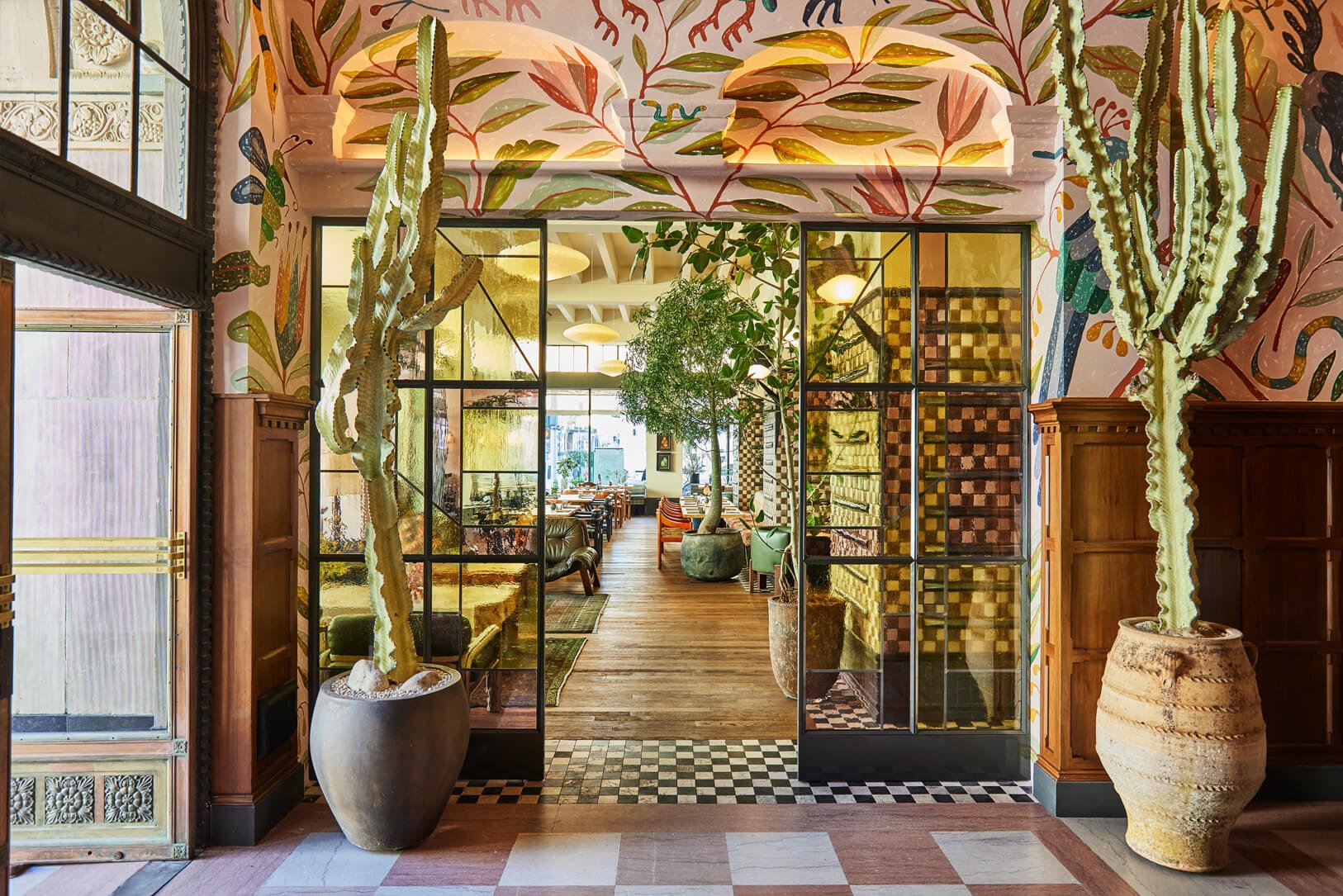
Kelly Wearstler's reimagining of a historic Downtown LA landmark seamlessly blends vintage charm with fresh design. The Downtown LA Proper boasts an eclectic mix of custom furnishings, complemented by handcrafted textiles and a stunning array of tiles. Every corner is meticulously adorned with attention to detail, transforming the space into a veritable treasure trove of design elements that pay homage to the building's heritage. Drawing inspiration from Spanish missions, Moroccan architecture, and Mexican Modernist art, the design reflects the cultural richness of the City of Angels.
Get the Look: Mix Pattern-On-Pattern
Kelly Wearstler is the queen of flawlessly blending patterns! Channel her signature style by embracing pattern-on-pattern design in your home. Begin by selecting a focal pattern, such as a bold rug or statement wallpaper, to serve as the foundation for your décor scheme. Then, layer complementary patterns of varying scales, such as geometric prints or floral motifs, through upholstery, drapery, or accent cushions. To maintain cohesion, stick to a limited color palette that everything together. Finally, incorporate solid elements, like sleek furniture or textured fabrics, to provide balance and visual interest.
Aman Venice
3. Aman Venice
Nestled within a historic palazzo on the Grand Canal, Aman Venice marries old-world opulence with modern sophistication. Designer Jean Michel Gathy juxtaposes rococo artwork with modern elegance furnishings and accents creating a captivating ambiance. The guest rooms showcase Italian masterpieces by renowned artists like Sansovino and Tiepolo. Contemporary furnishings harmonize with authentic silk wall coverings, chandeliers, wood paneling, chinoiserie, and painted ceilings, creating a seamless blend of history and modernity.
Get the Look: Blend Old and New
Capture the timeless elegance of Aman Venice by infusing old-world aesthetics with a modern sensibility. Embrace traditional architectural elements, like crown molding or wainscoting, to add character to your home. Opt for rich jewel-tone colors and opulent textures, think velvet upholstery, or elegant wallpaper, to evoke a sense of luxury. Incorporate a striking focal point like an antique fireplace, chandelier, or artwork. Pair these traditional elements with sleek and streamlined furniture pieces to create a harmonious fusion of past and present.
Hacienda de San Antonio, Mexico
4. Hacienda de San Antonio, Mexico
Set amid the natural beauty of a Mexican coffee plantation, Hacienda de San Antonio embraces traditional Mexican design with a luxurious twist. Designed by Alix Marcaccini and Armand Aubery, each room exudes a distinct charm, adorned with hand-made wool carpets from Oaxaca and European textiles. The grandeur of the space is accentuated by high ceilings and expansive French windows that seamlessly blend indoor and outdoor living. Cozy overstuffed sofas and wood-burning fireplaces add warmth and comfort, creating an inviting sanctuary.
Get the Look: Integrate Classic Mexican Elements
Embrace the rustic elegance of Hacienda de San Antonio by infusing your home with traditional Mexican influences. Incorporate handmade textiles, such as rugs or embroidered fabrics, to add warmth and texture to your space. Consider including rustic wood accents, like exposed beams or carved furniture, to evoke the charm of a Mexican hacienda. Bring the outdoors in with lush greenery, like potted plants or botanical-inspired artwork, to create a serene and inviting atmosphere.
L’Hotel Marrakech
5. L’Hôtel Marrakech
Stepping into L’Hôtel Marrakech feels like entering a bygone era of sophistication, reminiscent of the elegance of 1930s hotels. Originally part of a Caidal palace dating back to the 19th century, this historic Riad, owned by Jasper Conran, blends Moroccan craftsmanship with beautiful antiques and art from his collection. This meticulous attention to detail creates an ambiance that feels more like a refined home than a traditional hotel.
Get the Look: Capture the Essence of Morocco
To create a tranquil oasis inspired by L’Hôtel Marrakech, keep a neutral foundation and incorporate traditional Moroccan accents. Paint your walls in soft, neutral tones, such as white or beige, to create a sense of calm and serenity. Then, layer in pops of color and texture through Moroccan-inspired rugs, textiles, and decorative accessories. Look for intricately patterned rugs, embroidered cushions, and mosaic tiles to add visual interest and depth to your space. Finally, incorporate antique furnishings and artwork to capture the timeless allure of Marrakech's historic riads.
Hotel Proper, Downtown LA
Transform Your Home Into a Stylish Sanctuary
By drawing inspiration from these exquisite hotels, you can elevate your home's design to new heights. Whether you're drawn to the vibrant energy of Paris, the timeless elegance of Venice, or the exotic allure of Marrakech, there's a design aesthetic to suit every taste.
If you’re feeling inspired by these ideas but want professional guidance, we're here to help! Kristen Elizabeth Design is a full-service luxury interior design firm, based in Sacramento, serving Northern California and beyond.
Our team is dedicated to bringing your vision to life and overseeing all the intricacies involved in home design. From crafting a meticulously thought-out plan to seamlessly guiding you through the execution process, we handle every detail along the way, ensuring a stress-free experience from start to finish.
Ready to get started? Contact us today to discuss your unique project goals and needs.
Make your home your favorite place to be.
Design Week in Mexico City: A Spotlight on Kristen’s Favorite Artists
Explore Kristen's journey into Mexico City’s vibrant art and design scene, highlighting her favorite emerging artists and studios.
From Zona Maco and Studio Esrawe to Everything in Between!
This past February Kristen ventured to Mexico City for a design retreat—a journey filled with artistic inspiration, cultural immersion, and creative insights. Through exclusive access to renowned studios and exhibitions, she dove into the vibrant world of emerging art and design.
This month on the blog, we’re sharing highlights from Kristen’s enriching experience during design week in Mexico City!
Designed by Hector Esrawe
Dunes Design Retreat:
A Gateway to Inspiration
Kristen's design voyage was hosted by Dunes Design, an exclusive retreat tailored for discerning designers seeking to unravel the essence of Mexican creativity. Set against the backdrop of Zona Maco, the world's leading Latin-American art fair, the retreat offered a unique opportunity to engage with the pulsating energy of contemporary art and design. From intimate studio visits to curated exhibitions, Kristen delved into the heart of Mexico's design scene, forging connections with visionary creators and gaining fresh perspectives on the intersection of culture, heritage, and innovation.
Below we’re covering special highlights from her journey! Keep reading to learn all about it.
Design by Hector Esrawe
Hector Esrawe
At the forefront of Kristen's itinerary was a rendezvous with Hector Esrawe, the visionary force behind Esrawe Studio. Nestled within Mexico City's bustling streets, Esrawe Studio stands as a beacon of design innovation, seamlessly blending architecture, interior design, and product development.
Kristen was enthralled by Esrawe's holistic approach to design, rooted in a deep understanding of the human experience and spatial dynamics. From the conceptualization of bespoke furniture pieces to the olfactory symphonies of fragrance development, Hector's studio embodies a relentless pursuit of excellence and a commitment to pushing the boundaries of creativity.
Kristen had the privilege of touring his design firm, gaining insights into his creative process and sources of inspiration before heading to his studio where she explored the showroom and learned about the intricacies of his fragrance development.
It was truly a pleasure to peel back the curtain and gain a behind-the-scenes glimpse into his work and creative process. We’re hopeful for an opportunity to collaborate with him on a future project!
2. Ente Arte Objecto
One of the exhibitor highlights at Zona Maco was Ente Arte Objecto—where nature's raw beauty converges with artistic expression. Founded by Carmen Castillo, Ente Arte Objecto is a testament to the transformative power of stone, sculpted into functional art pieces that transcend conventional boundaries. From tables to organizational objects and accents, each piece meticulously crafted from exquisite stone, is a stunning blend of artistry and functionality.
Designed by Charabati Bizzari Ceramica
3. Charabati Bizzari Ceramica
Charabati Bizzari Ceramica was another exhibitor at Zona Maco that caught Kristen’s eye. Led by Raquel Charabati and Monica Bizzarri, this artisanal duo has redefined the boundaries of craftsmanship, transforming clay into breathtaking wall installations that blur the lines between tradition and innovation.
Kristen marveled at the meticulous precision and technical prowess displayed in each ceramic masterpiece, a testament to the enduring legacy of artisanal heritage fused with contemporary sensibilities.
Every artwork is one of a kind—crafted from thousands of carefully hand-formed and painted ceramic pieces. The result is a multi-dimensional sensory journey that enriches the ambiance of both interior and exterior spaces.
Final Thoughts
Kristen's design week in Mexico City was a transformative experience, punctuated by moments of awe, inspiration, and profound discovery. From the bustling exhibitor booths at Zona Maco to the innovative sanctuary of Esrawe Studio each encounter unveiled a new facet of Mexico's rich cultural mosaic.
As Kristen returned home, her heart brimming with creative fervor and her mind ablaze with newfound insights, she carried with her the enduring legacy of Mexican artistry and craftsmanship—a testament to the transcendent power of design to inspire, uplift, and transform lives.
Ready to get started? Contact us today to discuss your unique project goals and needs.
Make your home your favorite place to be.
Wallpaper Design Guide: How to Seamlessly Incorporate Wallpaper Into Your Home
Step into the world of wallpaper! Learn about different materials and creative ways to add wallpaper to your home, from subtle accents to bold statements.
Wallpaper is back, and in a big way!
When you think of wallpaper, images of your parent's old kitchen with noisy patterns might come to mind. But, the truth is, wallpaper is anything but dated. The iconic wall treatment is having a major moment in interior design and it's so versatile!
If you’ve been wanting to decorate with wallpaper, but feel intimidated then keep reading. In this guide, we're reviewing all the ways you can incorporate wallpaper into your home to elevate your spaces and create a unique and personal environment.
Designed by Kristen Elizabeth Design, Photographed by Kat Alves, Wallpaper is Thibaut
Wallpaper Types and Materials
Design by Kristen Elizabeth Design, Photographed by Rikki Snyder, Wallpaper is Abigail Edwards
When exploring the world of wallpaper, let’s first cover the types of materials available, as each offers unique characteristics and suitability for different environments.
Vinyl
Known for easy installation and removal, vinyl wallpaper is one of the most common types of wallpaper. It's also a great choice for areas prone to moisture, like kitchens and bathrooms, and often comes pre-pasted, simplifying the hanging process.
Non-Woven
Non-woven wallpaper is resistant to moisture and water, making it an excellent option for humid environments. Its adhesive backing adheres directly to the wall, ensuring straightforward installation.
Paper
Paper wallpaper beautifully showcases color and patterns. However, it's less durable than other types and can scratch or tear. While delicate, paper wallpaper offers a classic aesthetic that can enhance any room.
Fabric
Fabric wallpaper is a luxury option. Unlike vinyl, fabric wallpaper doesn't come pre-pasted and requires careful installation to prevent wrinkles and air bubbles. Fabric wallpaper adds elegance and sophistication to any space.
Grass Cloth
Made from natural woven fibers grass cloth wallpaper has a unique texture and aesthetic. Unlike patterned wallpaper it doesn't require precise matching, making it easier to hang. The organic aesthetic of grass cloth adds depth and character to your walls, creating an inviting atmosphere.
By understanding the distinctions between these wallpaper materials, you can make informed decisions based on your design preferences and the needs of your space. Whether you prioritize durability, aesthetics, or ease of application, there's wallpaper that’s right for you.
What to Consider When Choosing Wallpaper
Design by Kristen Elizabeth Design, Photographed by Rikki Snyder
Selecting the right wallpaper involves more than knowing your materials and picking a pattern you like. It's about harmonizing with your home's existing décor, setting the mood for each room, and expressing your personality.
Wallpaper is a bigger commitment than paint color, so you’ll want to ensure you’re happy with your selection. If you’re considering patterned wallpaper think about the scale of the pattern and how that relates to the scale of the room, in addition to the other patterns already in the space.
Take into account the function of each space—whether it's a cozy bedroom retreat or a vibrant living room gathering place—choose patterns, colors, and textures that reflect its purpose and ambiance.
Different Ways to Design with Wallpaper
Design by Kristen Elizabeth Design, Photographed by Kat Alves, Wallpaper is Arte International
Incorporating wallpaper into your home design offers endless possibilities for adding personality and charm to your living spaces. Whether you prefer subtle elegance or bold statements, there are various approaches to integrating wallpaper into your interior décor.
Make a Subtle Statement
If you're hesitant about diving headfirst into wallpaper design, consider these subtle yet impactful ways to include wallpaper in your home.
Accent Wall: Opt for a single wall as a focal point, allowing the wallpaper to command attention without overwhelming the entire room. Also, consider unconventional options like wallpapering the ceiling for an unexpected element and added visual interest.
In our Sag Harbor Modern project, we incorporated a wallpaper headboard accent wall in each bedroom. This design choice allowed us to set the tone to fit the function of each room, from the main bedroom to the guest room, and kid's room.
Nook or Partial Wall: Transform overlooked spaces like nooks or alcoves into cozy retreats by adorning them with wallpaper. Or consider adding wallpaper above wainscoting to create a cohesive look that draws the eye upward.
Small Room: Smaller rooms, such as powder rooms or guest bathrooms, provide the perfect canvas for experimenting with bold prints or vibrant colors. The limited space allows for more daring design choices without feeling overpowering.
In one of the bathrooms of our El Dorado Modern project, we went with a watercolor-inspired wallpaper while keeping the rest of the design elements minimal. The fun print works well in the smaller space while tying into the color palette of the rest of the home.
Subtle Wallpaper: Even if you want to wallpaper a whole room, can you do so without making a bold statement. By choosing solid, textured, or subtly patterned wallpaper you can enhance the room's ambiance without overwhelming the senses.
For example, in our project Eric’s House, we used a cream grasscloth wallpaper in the main bedroom. Rather than a striking focal point, it’s the perfect accent to the room, adding beautiful texture while complimenting the rest of the design.
Make a Big Impact
If you want to make a bold statement, explore these ways to incorporate wallpaper as the focal point of your home design.
Bold Color or Pattern: Embrace drama with wallpaper featuring large prints, intricate patterns, or vibrant colors. Eye-catching designs instantly elevate the aesthetic appeal of any room, infusing it with personality and style.
In the breakfast nook of our Artful and Glamorous project, we incorporated a whimsical yet sophisticated frog wallpaper. The large pattern suits the scale of the space and makes it a striking focal point.
Mural Wallpaper: Transform your walls into works of art with mural wallpaper, which creates stunning visual narratives and adds depth to your space. From picturesque landscapes to abstract motifs, mural wallpaper allows you to make a bold design statement while transforming the feel of a room.
For the main bedroom of our Artful and Glamorous project, we chose a beautiful yet serene floral mural wallpaper. It instantly elevates the space, converting their bedroom into a sophisticated yet relaxing retreat.
Full Room: To create a cohesive and immersive environment consider wallpapering a full room. Whether you choose to cover all four walls or combine wallpaper with complementary paint colors, a fully wallpapered room makes a powerful visual impact. Consider extending the wallpaper to the ceiling for a seamless effect, or opt for wallpapering half a room to introduce texture and depth while maintaining balance.
By exploring these different approaches to wallpaper design, you can tailor your home design to reflect your style and preferences. Whether you prefer understated sophistication or bold statements, wallpaper offers a versatile and creative way to transform your living spaces.
Wallpaper Installation Tips
Design by Kristen Elizabeth Design, Photographed by Stephanie Russo, Wallpaper is Feathr
Proper preparation is key to achieving professional results when installing wallpaper. Make sure your walls are clean and primed before installation. Regardless of the type of wallpaper you choose, we recommend going with professional installation. This will not only save time and minimize potential issues but will ensure your wallpaper is seamlessly installed.
Wallpaper Maintenance
Design by Kristen Elizabeth Design, Photographed by Ellen Vanessa, Wallpaper is Phillip Jeffries
To prolong the lifespan of your wallpaper and keep it looking its best, follow manufacturer guidelines for cleaning and maintenance. In high-traffic areas, opt for durable wallpaper materials that can withstand daily wear and tear. Should you wish to refresh your space without a complete overhaul, consider wallpaper accents or removable wallpaper options for quick and easy updates.
Final Thoughts
Design by Kristen Elizabeth Design, Photographed by Ellen Vanessa, Wallpaper is Anewall
Incorporating wallpaper into your home décor allows you to infuse your style and creativity into every corner of your living space. By following these expert tips, you can confidently embark on your wallpaper design adventure and transform your home into a reflection of your unique personality and aesthetic vision.
If you need more guidance or want to take on a bigger home design project then call in the pros! We’re here to make your design journey as easy as possible. From multi-room refreshes to new construction or remodel projects we’ll bring your dream home to life!
Ready to get started? Contact us today to discuss your unique project goals and needs.
Make your home your favorite place to be.
Our Top 5 Artist Picks to Beautify Your Space
Looking for artful inspiration? We’re rounding up our top 5 favorite artists to add beauty and character to your home.
Add some personality to your walls...
A great piece of artwork can serve as the jumping-off point for the design of a room, or act as the perfect finishing touch. If you have blank walls to fill or are looking to expand your art collection, we’re rounding up five artists that we’ve been following and can’t wait to incorporate into our projects. These creators offer diverse styles, from minimalist expressions to captivating landscapes and sculptural wonders. Keep reading to see who made the list!
Painting by Victor Butko
Viktor Butko
Painting by Victor Butkho
Viktor Butko is primarily known for his large-scale impressionist landscape paintings. Originally from Moscow, he lives and works in Massachusetts. As a plein-air style painter, he frequently immerses himself in nature and paints outdoors, to capture the essence of a scene.
He’s endlessly inspired by the beauty of nature and is drawn towards capturing dramatic moments–like the calm before a storm or the ethereal glow of moonlight. His work, represented by renowned galleries such as Grenning Gallery in Sag Harbor, NY, weaves a melodic tapestry with nature.
Darius Yektai
Painting by Darius Yektai
Darius Yektai, an expressionist painter based in Sag Harbor, NY, paints with a vibrant palette that spans figurative pieces, monochromatic still lifes, and colorful abstract works. His signature style involves thick expressive strokes and layered paint, giving his pieces a tactile sculptural quality. Also, represented by Grenning Gallery, Yektai's medium to large pieces are perfect statement additions to any living or dining room.
Robert Schwarzenbach
Painting by Robert Schwarzenbach
San Francisco-based painter Robert Schwarzenbach is a master of impactful color block paintings. Focused on geometric abstraction, his works tell a captivating story through vibrant hues. Bridging the gap between modern and traditional styles, Schwarzenbach's creations are perfect if you’re looking to infuse your space with a pop of color. Discover his work at the Hunters Point Shipyard open studios or on his Instagram.
Annie Murphy Robinson
Charcoal Drawing by Annie Murphy Robinson
If you like dramatic figurative works, you don’t want to miss Annie Murphy Robinson. She creates stunning hyper-realistic charcoal drawings. Using a reductive process, she sands charcoal into heavy printmaking paper, creating images that feel weathered and exude authenticity. Limited Edition prints are available on her website, while original drawings can be found on Arts, Arcadia Contemporary Gallery, and Winfield Gallery Robinson also welcomes commissions for custom artwork, offering a personalized touch to your collection.
Linda Fahey
Art Installation by Linda Fahey, Image Courtesy of Coup D’etat
Linda Fahey's sculptural and functional ceramics bring the coastal lifestyle to life. Drawing inspiration from ocean waves, whales, and the elements, Fahey's hand-built forms showcase a modern design aesthetic. She owns a ceramic shop, YONDER, which features her work along with pieces from other talented ceramic artists.
For a unique one-of-a-kind statement artwork, we love her custom tile installations made especially for each space. There’s nothing more special than a piece of art created just for you.
If you’re feeling inspired by these artists and would like assistance incorporating artwork into your home design, we’d love to help!
Ready to get started? Contact us today to discuss your unique project goals and needs.
Make your home your favorite place to be.
Top Interior Design Rules to Follow (And When to Break Them)
Unlock interior design secrets—from color schemes to furniture arrangements. Learn when to follow the rules and when to break them to design with confidence!
Design Your Home Like a Pro
You want your home to not only look stunning but also seamlessly reflect your style and function with practical elegance. As you embark on an interior design journey, questions about the ideal drapery length, the perfect height for hanging artwork, and the optimal furniture spacing naturally arise.
Navigating the intricate web of these design details is like deciphering a blueprint, a roadmap for crafting spaces that are not only visually appealing but also tailor-made to suit your lifestyle. In this blog post, we delve into the world of interior design rules—when to follow them and when to break free—empowering you to approach home design with confidence. So, let's unravel the mysteries and embark on a journey to transform your interiors!
Kristen Elizabeth Design, Photographed by Kat Alves
How to Create a Color Scheme
The color palette is often a starting point for any design project. When planning the color scheme for a room see what colors you’re drawn towards—this could be from inspiration photos, artwork, or a prominent design element you have in mind for the space.
During this process, understanding the color wheel is important, which offers insights into the realms of analogous, monochromatic, and triadic color schemes. For those seeking contrast, consider complementary and split-complementary schemes.
The Design Rule:
At the core lies the art of utilizing neutral colors as a foundation, all within the framework of the 60-30-10 Rule for crafting a balanced and visually appealing space. We’re breaking this rule down below:
60% of the room as your main color: things like wall color, flooring, and large pieces of furniture.
30% of the space as your secondary color: think medium-size furnishings and accents.
10% of the room as your accent color: things like small accents and decor.
When to Break This Design Rule:
There are ways you can switch up this rule. For example, you can do 10% of two different coordinating accent colors or you can use this rule in a monochromatic color palette with three varying shades of the same color. Many designers use this same principle but with a 70-20-10 balance. More important than sticking to the rule is paying attention to the feel and how the colors balance the space.
Kristen Elizabeth Design, Photographed by Kat Alves (Left), Ellen Vanessa (Right)
How to Hang Artwork
Hanging artwork is an important aspect of rounding out the design of a room—it can make the space feel beautiful, polished, and personal. But if done poorly it can ruin the room. In this next section, we’re diving into simple rules for hanging artwork like a professional.
The Design Rule:
The center of the artwork should be at eye level—60 inches from the floor. Here’s a step-by-step guide:
Mark the 60-inch point at the center point of your wall. This is where the center of your artwork will go.
Measure the total height of your frame and divide it by two to pinpoint the center.
Measure from the top of the frame to the top of your securely tightened picture hanging wire or hook. Deduct this measurement from the center frame measurement obtained in Step 2. This result indicates how far above the picture's center point your hook (or hanging mechanism) should be positioned.
Add the measurement from Step 3 to the 60 (your center height). This final sum represents the distance from the floor to where you should install your hook or nail, or your hang height. And remember measure twice and drill once!
When to Break This Rule:
This rule is great to use as a general guideline but it won’t work for all scenarios. Below are situations you’ll want to rethink this rule.
For a gallery wall: In this case, the center of your grouping of artwork should be around 60 inches with a few inches between each artwork.
Artwork over furniture: Aim to have 6-8 inches between the bottom of the frame and the furniture. They should be close enough that they visually appear as one unit in the space. The artwork should also be roughly ⅔ the length of the furniture.
For high ceilings: You’ll want to go a few inches above 60.
You’re layering and leaning artwork: You don’t have to hang artwork. You can lean it on a shelf, console, or dresser on its own or with a grouping of pieces in varying sizes.
If the 60-center rule doesn’t feel right for your space, hold your artwork at different heights and stand back to get a feel for what looks best!
How to Hang Drapery
Choosing the right window covering length involves a careful dance between functionality and aesthetics. It may seem straightforward but there are several factors you’ll need to consider including the size of the windows, the height of your ceilings, and what kind of hanging style and hardware you want. You’ll also want to think about whether a standard size will work or if you’ll need a custom length.
The Design Rule:
Rule of 10s: Aim to hang curtains 10 inches above the window trim and 10 inches wider than the window on each side. They also could be floor length, skim the floor, hang ½ an inch above the floor, or pool on the floor.
When to Break This Rule:
Again this general rule doesn’t work for every home. For higher ceilings curtain rod placement should be a few inches below the crown molding or 12 to 24 inches above the window trim.
For lower ceilings, the curtain rod should be placed close to the ceiling to create the illusion of height.
Kristen Elizabeth Design, Photographed by Kat Alves
How to Arrange Furniture
Whether you’re arranging furniture in the bedroom, dining room, or living room, considerations for spacing and furniture scale impact room perception.
The Design Rules:
Again much will depend upon the size and scale of your home, but here are our furniture layout and spacing guidelines:
Leave 30 inches of walkway between large furniture pieces
Allow 14-18 inches between a coffee table and a sofa
Allow 4-10 inches of space between seating
When placing a sofa against the wall, leave 3-5 inches between the sofa and the wall
Area rugs should be large enough for the front legs of the sofa and all chairs at least
When pairing a sofa with accent chairs and coffee tables all the heights should be within 4 inches of each other
Nightstands should be 5 inches higher or lower than the top of your bed
For dining tables give 24 inches of space per person
When to Break the Rules:
These guidelines are very helpful to ensure you have good proportions and flow throughout your spaces. It may be challenging to stick to these measurements for smaller spaces. For example, 30 inches of walkway may not be possible, so in these cases leave a minimum of 18 inches. Also, play with smaller-scale furniture pieces so the room doesn’t feel too cramped.
How to Select Lighting
When designing your home lighting may be an afterthought, but it shouldn’t be. Proper lighting is a cornerstone of interior design, setting the mood and feel of a space while enhancing the overall aesthetic.
The Design Rules:
When planning your lighting scheme throughout your home, keep the following rules in mind.
Each room should have 2-3 lighting sources, don’t just rely on overhead lighting which can cast unwanted shadows and be unflattering. Use a combination of floor lamps, table lamps, pendants, and/or scones to create layered lighting effects and lighting control for each room. (Don’t forget dimmers allow for extra light control!)
Place your lighting sources strategically, and don’t forget task lighting.
Light bulbs should be hidden.
Pay attention to the light bulb tone and select a cohesive color temperature. We recommend warm white shades for an inviting atmosphere. (Color temperature—warm vs. cool—refers to the amount of whiteness in the light, which is measured in kelvins.)
When to Break These Rules:
While you don’t want to overdo overhead lighting, there are some cases where it’s ok to use overhead lighting like for a hallway or when you need to brighten the space for cleaning. Rooms that need brighter light like the kitchen and bathrooms also benefit from overhead lighting. Dimmers also help overhead lighting feel less bright and harsh.
Kristen Elizabeth Design, Photographer by Kat Alves (Left) & Ellen Vanessa (Right)
Call in the Pros
If you’re feeling overwhelmed by these rules and aren’t sure which ones to stick to (or break) then call in the design professionals! At Kristen Elizabeth Design, a full-service interior design firm serving the greater Sacramento area, we specialize in creating thoughtful, unique spaces that represent our clients.
We’ll worry about the details so that you don’t have to, creating beautiful yet functional interiors that you’ll love.
Ready to get started? Contact us today to discuss your unique project goals and needs.
Make your home your favorite place to be.
Luxury Redefined: Unveiling the Art of High-End Kitchen Design
Looking to upgrade your kitchen? From high-end appliances to personalized details, we’re diving into everything you need to know about luxury kitchen design.
Turn Your Ideal Kitchen Into A Reality
In today's homes, the kitchen is more than a place to cook; it's the central hub where loved ones gather and make memories. A luxury kitchen is not only about aesthetics but also optimum functionality and creating an inviting space that reflects your lifestyle.
Whether you love to cook for your family, or you’re always hosting dinner parties and holiday gatherings, your kitchen can transform the experience. In this post, we delve into the heart of the home—the kitchen—and explore the world of luxury kitchen design. Keep reading to discover how a well-designed kitchen can elevate the entire feeling of your home.
Imagine Your Dream Kitchen
When you think of a high-end kitchen different images may come to mind, from expansive kitchen islands, to sleek modern finishes, to the latest gadgets and appliances…the reality is, that luxury is very personal and has different meanings from one person to another. First, you have to ask, what does luxury mean to you? What does your dream kitchen look and feel like?
Gather inspiration from design magazines and online publications along with social media and start noting the trends you’re seeing. What style exudes luxury? What colors are you drawn towards? What materials and features would you love to have?
Once you start narrowing down your inspiration photos and put together a wishlist, a picture of your ideal kitchen will start to take shape.
Kristen Elizabeth Design, Photographed by Kat Alves (Left), Stephanie Russo (Right)
Luxury Kitchen Essentials
To guide you on your journey of discovering your personal form of luxury, we’re covering some of the common elements of high-end kitchen design so you can see what resonates with you and would work for your lifestyle.
1. High End Appliances
Luxury begins with cutting-edge technology. Explore the latest in kitchen appliances, from smart refrigerators that seamlessly integrate with your lifestyle to state-of-the-art ovens that redefine culinary precision. Top high-end brands that marry functionality and sophistication include Wolf, Miele, Gaggenau, True Residental, and La Cornue.
These brands not only embrace the latest technological advancements but also embody a commitment to exquisite craftsmanship, ensuring that every appliance becomes a statement piece in your kitchen. Elevate your culinary experience with innovative features and impeccable design, where form meets function in perfect harmony.
2. Premium Materials & Finishes
The choice of materials can make or break a luxury kitchen. Dive into the world of high-quality countertops, cabinetry, and flooring, and learn how premium finishes contribute to the overall opulence of the space.
When it comes to materials, the options are endless, for inspiration here are some ideas to transform your kitchen from ordinary to extraordinary:
Glam metallics: If you think of glitz and glam as the epitome of luxury, then incorporate luxurious metal finishes from stainless steel to golden brass.
Statement stone: Luxury marble, Italian porcelain, or quartzite countertops can be the centerpiece of your kitchen.
Handmade tile: If you’d like your backsplash to be the star of the show, consider a beautiful handmade tile option.
Add some drama: A bold lighting feature, a custom vent hood, or a dark or daring color palette can make a beautiful statement in your kitchen.
3. Innovative Storage Solutions
A clutter-free kitchen is a luxurious kitchen. Regardless of the size of your kitchen, invest in storage solutions designed to maximize space and efficiency while maintaining a sleek and elegant aesthetic. Utilize features like built-in storage, lower and upper cabinetry, floating shelving, and/or a pantry.
Thoughtful storage solutions also include specifications for how each drawer and cabinet is used to help you stay organized and save time. No inch is overlooked! Consider in-counter receptacles for food waste, or refrigeration built into or under countertops so your island can transform into a chilling serving station for entertaining.
4. Custom Design Features
Nothing says luxury more than custom features that are tailored to your needs and lifestyle exactly. Custom design solutions can make the difference between a kitchen that you like vs. one that you love because it’s unique to you. There are plenty of ways you can customize your kitchen including:
Custom layout
Bespoke design features and finishes
Artisan furnishings
Custom cabinetry
Also, consider any luxury extras you’ll want to integrate into your kitchen design to add even more convenience and functionality, ensuring everything you need is at your fingertips. Ideas include:
Wine fridge
Second-sink in an island, at a coffee or bar station
Pot filler at the stove
Double oven
Filtered water faucets
Double islands
If you have the square footage available consider a butler’s pantry or a second working kitchen for next-level luxury. These areas typically house additional refrigeration, cooking equipment, and prep space. They can also double as a canning/preserving space, or garden pantry. When you’re entertaining, a less visible ‘working kitchen’ allows your front kitchen to be the star of the show while all the mess can stay in the back, hidden from guests.
It’s the special custom elements that are made especially for you and your household that can really elevate your kitchen space. Think of features that not only accommodate your current lifestyle but also your future needs, making your luxury kitchen a timeless investment that evolves with you.
5. Impeccable Layout
High-end kitchens not only look photo-worthy but are also planned to be functional. Carefully consider the layout, ensuring the placement of the sink, appliances, cabinetry, shelving, and countertops contribute to the function of your kitchen. This thoughtful planning ensures a seamless workflow, allowing for effortless movement and access to essential components.
A well-considered layout also maximizes the use of space, whether your kitchen is a cozy urban enclave or a sprawling open-concept design. Each inch is purposefully designed to offer ample storage and create an atmosphere of openness and accessibility. Beyond your kitchen, a thoughtful layout seamlessly integrates the space with the rest of your home, fostering a cohesive design scheme that transcends individual spaces.
6. Dazzling Details
While big purchases like appliances and major materials are crucial, don't overlook the details. Thoughtful smaller elements can make a big impact on the feel and functionality of a space. Consider the following elements with care
Lighting: Ensure your light fixtures coordinate with your design scheme. Consider various lighting sources, from overhead ambient lighting to under-counter task lighting.
Faucets and Hardware: Select faucets and hardware that accentuate your desired aesthetic, whether it's a stainless steel finish, matte black, or gold brass. Details like a touchless faucet can enhance the convenience of using your sink. While filtered water faucets make clean fresh drinking water easily accessible.
Styling Details: Mix and match textures to add layers of visual interest to the space. Elements like rugs, dishware, and decorative accents introduce another dimension to your kitchen design.
Remember that your kitchen is more than a space for cooking—it's a reflection of your lifestyle and a place where memories are created. For inspiration, step into our portfolio as we showcase some of our most exciting projects. Explore the possibilities with Kristen Elizabeth Design and let us help you make your home your favorite place to be. Get in touch to learn how we can make your dream kitchen a reality.
Designed by Kristen Elizabeth Design, Photographed by Kat Alves
Make your home your favorite place to be.
Ready to get started? Contact us today to discuss your unique project goals and needs.
Planning A Remodel? The Essential Guide to Transforming Your Home
Thinking of embarking on a remodel or renovation project? Check out our complete remodel guide to plan your project like a professional.
Begin Your Remodel Like A Pro
Remodeling your home can be an exciting yet daunting endeavor. Whether you're revamping your kitchen, updating a bathroom, or transforming your entire home, proper planning is crucial for a successful remodel project. Without a clear plan in place, even the most straightforward renovations can quickly go haywire. In this guide, we'll walk you through important steps and considerations to ensure that your remodel is a success.
assess the project scope
Before diving into the world of design inspiration and color palettes, you’ll want to assess the scope of your remodel project. This includes, clearly defining your goals, setting a realistic budget, and establishing a feasible timeline. When defining your goals, consider what you aim to achieve with your renovation. Some examples include
Adding more space
Improving functionality
Updating aesthetics
Increasing the value of your home
At this time you’ll also want to consider your priorities. You may ideally want to overhaul your entire home, but realistically you may only be able to afford a kitchen renovation. If that’s the case then consider tackling your remodel in phases. Think about your must-haves vs. nice-to-haves and what updates you’ll need done sooner rather than later.
Once you have the project scope, objectives, and priorities defined you can start thinking about your budget. Start by ballparking costs and determining how much you can spend. Understanding these details from the outset will help you stay on course and avoid unexpected delays and expenses down the line.
gather inspiration
Next, you’ll want to find inspiration for your new space. From flipping through design magazines to browsing online platforms, like Instagram and Pinterest, exploring different design ideas will help you refine your vision and identify your unique style preferences.
During this phase consider how you want the space to feel and what styles you’re drawn towards. Unless you’re starting with a blank slate or doing a full overhaul you’ll also want to consider what will work with the existing style of your home.
The wealth of online resources available makes gathering inspiration easier than ever, allowing you to curate a collection of ideas that resonate with your taste and lifestyle.
Kristen Elizabeth Design Photographed by Rikki Snyder (Left), Kat Alves (Right)
Find the Right Professionals
Choosing the right professionals for your remodel project is crucial for its success. Whether it's selecting reputable contractors or hiring experienced designers or architects, conducting thorough research and checking references is essential. Here’s a brief overview of relevant professionals so you can hire to determine the right ones based on your needs.
Architect:
If you're making big changes to your home's structure, you'll need an architect or engineer.
They’re educated and licensed in design theory, engineering, and project management.
Architects handle design, engineering, and code requirements, while engineers focus on structural aspects.
Stamped plans from architects or engineers are necessary for city permit approval.
Interior designers focus on the details, aesthetics, and functionality of your home's design.
They handle floor plans, construction details, lighting, and all finishes and furnishings while ensuring designs meet local code requirements.
They create a cohesive design, considering both aesthetics and functionality.
General Contractor:
Contractors bring the architect and designer's ideas to life and solve construction issues.
They focus on implementing the vision while managing construction costs effectively.
Contractors handle tasks like plumbing and electrical changes and ensuring structural integrity.
At Kristen Elizabeth Design, a full-service luxury design firm, we work with a network of trusted professionals and can bring our partners to your project for the best results. We’ll liaise with all parties to ensure plans are developed and executed correctly and that any issues are swiftly resolved. With our expertise and guidance, we help streamline the entire process, ensuring that your remodel is managed with precision and efficiency.
create a design plan
A well-thought-out design plan is the cornerstone of any successful remodel project. This is where we’ll start to take the burden off your shoulders, from developing an optimal layout to carefully selecting the appropriate materials, we’ll ensure that every aspect of the plan aligns with your vision, budget, and functional requirements.
Our designs expertly balance aesthetics with functionality to create a space that is not only beautiful but also practical and comfortable. In a series of meetings, we’ll present design renderings, materials, and furniture options that culminate in a beautiful and cohesive space that represents you.
Prepare for the Remodel Process
Once you’ve signed off on the design for your new space, you then need to prepare your home for the renovation process to facilitate a seamless transition. Clearing the area, organizing your belongings, and communicating any specific requirements to our team are essential steps in ensuring a smooth start to the remodel. Establishing practical expectations and fostering transparent communication can minimize potential challenges that may emerge.
Depending on the project scope, we may recommend moving out during construction so that you don’t have to deal with debris and noise impacting your daily life. Whether you stay with family, friends, or find a short-term rental, you’ll want to factor that into your overall timeline and budget.
During the Remodel Process
Once the remodel is underway, we’ll regularly monitor its progress. This includes addressing any issues promptly and managing changes efficiently to keep your project on track. We’ll also maintain quality control throughout the process to ensure that the result reflects the goals you initially set out to achieve.
Final Touches
As the project nears completion, adding those personal touches that make a space truly yours is the final step. Also known as styling—we’ll include decorative accents, artwork, plants, and home accessories that’ll make your new spaces feel personal, inviting, and lived-in.
Conducting final inspections and ensuring that every detail meets your standards is essential before considering the project complete.
By following the steps in this guide, you can plan your remodel with confidence. We’ll help you navigate the complexities of the process to achieve the space of your dreams—one that not only enhances the aesthetics of your home but also enriches your daily life.
Make your home your favorite place to be.
Ready to get started? Contact us today to discuss your unique project goals and needs.
How to Prepare Your Home for Fall and Winter
Are you prepared for the colder weather? Ready your home for fall and winter with our expert design tips, so you can enjoy your interiors all season long.
Create Warm and Inviting Spaces
Are you prepared for the colder weather? Ready your home for fall and winter with our expert design tips, so you can enjoy your interiors all season long.
Kristen Elizabeth Design, Photographed by Stephanie Russo
As the leaves change color and the air turns crisp, it's time to bid farewell to the warmth of summer and welcome the cozy embrace of fall and winter. These seasons bring with them the perfect opportunity to transform your home into a haven of comfort and style.
At Kristen Elizabeth Design, a full-service luxury interior design firm, we understand the importance of creating a space that envelops you in warmth and elegance. This month on the blog, we’re covering the essential steps to ready your home for the colder months.
Fall Color Palette
Fall is a season of rich, earthy hues that can instantly transform your living spaces. Embrace the warmth of autumn by incorporating trending fall color palettes into your interior design.
Explore fall-inspired paint colors or home decor. From deep burgundies and warm oranges to cozy browns and muted greens, these colors can set the perfect tone for your fall-inspired atmosphere.
Credit-House Beautiful, Photographed by Eric Piasecki (Left),Kristen Elizabeth Design, photographed by Kat Alves(Right)
Introduce Warm and Cozy Textures
Part of creating a warm environment is including a range of seasonal materials. Think plush rugs, velvety cushions, and soft wool throws. These textures add comfort, create a sense of coziness, and help insulate your home. Layering your interiors with these elements can instantly make your spaces feel inviting and sung.
Whether it's a luxurious area rug in the living room or a collection of throw pillows in the bedroom, take stock of each room in your home and look for opportunities to add a cozy touch.
Check Your Fireplace and Heating Solutions
As the weather starts to get colder, you’ll want to make sure your home is in good shape to keep you warm. This includes checking your heating systems.
A well-maintained fireplace is a quintessential feature of any fall or winter-ready home. As the temperatures drop, your fireplace becomes the heart of your living space. Ensure it's clean, functional, and beautifully decorated to enhance the ambiance.
You’ll also want to make sure your HVAC system is ready to go. This includes replacing the filter, dusting your vents and making sure they’re open, covering up your AC condenser, and checking that the heat is working properly.
Incorporate Layering and Fall/Winter Accessories
One of the secrets to a cozy home during fall and winter is layering. Switch up your lighter fabrics for heavier ones—think flannel sheets and cozier bedding. Add depth and warmth by layering blankets, throw pillows and curtains. Experiment with different fabrics and patterns to create a visually pleasing and snug environment.
Don’t Forget the Lighting and Ambiance
Lighting can transform the atmosphere in your home. Opt for warm and ambient lighting to set the mood and create a cozy ambiance. Soft, gentle glows from table lamps, sconces, and pendant lights can set the tone for relaxation and comfort.
Seasonal Decor and Floral Arrangements
Celebrate the beauty of fall and winter with seasonal decor and floral arrangements. Bring the outdoors in and have fun with accents. From pumpkins and wreaths to elegant centerpieces, there are endless ways to infuse the spirit of the season into your home.
Designer Kristen Elizabeth Design, Photo Credit Stephanie Russo (Left), & by Rikki Snyder (Right)
Prepare Your Outdoor Spaces
Don't forget about outdoor design! Prepare your yard, garden, patio, or balcony for the colder months with appropriate landscaping and outdoor decor.
Transform your outdoor spaces into cozy retreats, ensuring you can enjoy the beauty of fall and winter even outside your home. Adequate lighting and heating solutions like a fire pit, fire table, or outdoor heaters can let you enjoy your outside living spaces into the cooler months.
Or if you live in an environment that gets too cold, winterize your landscaping and protect your outdoor structures from the elements. Clear off your decks and patios and cover and store your outdoor furnishings.
As fall and winter approach, take the time to prepare your home for the changing seasons. Kristen Elizabeth Design is here to guide you through every step, from selecting the perfect color palette to creating a warm and inviting atmosphere. Let us help you transform your space into a haven of comfort and style where you can embrace the magic of fall and winter.
Ready to get started? Contact us today to discuss your unique project goals and needs.
Design Spotlight:
Step inside our El Dorado Modern project to learn how we brought this home to life for our clients who needed both style and function.
El Dorado Modern Project
This month on the blog, we’re offering a behind-the-scenes look into one of our favorite projects, El Dorado Modern.
Photographed by Stephanie Russo
Not only was this project rewarding and challenging, but it also won the International Architecture and Design Forum’s international design competition. Not to mention, it’s featured in numerous prestigious publications including AD Middle East, Casa Vogue Brazil, Real Simple, Sacramento Magazine, Mansion Global, and more.
We were brought in during the planning and design phase of this new construction project in El Dorado Hills, Ca to create a cohesive and seamless environment for a young family. Keep reading for all the details about this home that encapsulates the essence of modern living.
Project Overview
Spanning 5500 square feet, this contemporary home was a blank canvas, beckoning us to create a warm and sophisticated environment. Along with the full interior design of the space, we were called upon to craft exterior finish palettes and materials to create a comprehensive design journey.
Each room is a chapter in a story of progression. The core spaces are thoughtfully curated to cater to the diverse needs of family life—from entertaining guests to accommodating work, study, and the simple joys of togetherness. While the bathrooms include bold pops of color, the main spaces remain more natural with colorful accents and ranges of texture. The design ethos is devoid of pretense, embracing the authentic spirit of family dynamics while maintaining a clean modern aesthetic.
Photographed by Stephanie Russo
Design Inspiration
Drawing inspiration from the organic warmth of nature, we infused the design with contemporary elegance. Our palette paints a picture of earthy tones with vivacious splashes of color that dance throughout the home. The goal was to strike a harmonious balance between the familiar comforts of a family home and the bold strokes of contemporary design, resulting in a sophisticated yet family-friendly space.
Client's Vision
Central to the process was aligning our vision with our client’s aspirations. The goal? To sculpt an environment where modernity mingles with warmth, epitomizing style, and comfort. The essence of modern living was carefully threaded into every choice, each room a testament to a conscious design narrative. The integration of color was strategically orchestrated to maintain the fluidity and harmony that define this sanctuary.
Mindful of the chaos that pets and kids can bring, we curated an assortment of fabrics that are both resilient and elevated, embracing the perfect blend of performance and luxury. Everything needed to be stylish yet functional.
Our clients were a joy to work with, giving us guidelines while allowing us to flex our design muscles. They were willing to explore new styles and step out of their comfort zone—while providing valuable feedback to help us achieve results that were authentic to them.
Photographed by Stephanie Russo
Design Highlights
In the heart of the home, the living room and kitchen seamlessly unite modern furnishings with thoughtful textiles. In the living area, we incorporated a custom flat-weave patterned rug by Jaipur Rugs. It not only grounds the seating area but is just as pet-friendly as it is stylish. A bespoke navy blue leather sofa from Black Label Home injects color and functionality. Wooden swivel chairs from Four Hands were reupholstered with performance fabric, infusing character into the space.
The kitchen's breakfast area is a charming nook, featuring a concrete table from Mr. Brown London beneath the striking industrial pendant by Moooi Lighting. The dining chairs were also upholstered in performance fabric, elevating both style and practicality.
The dining room is a knockout with a 45-inch statement light fixture by Eurofase, and a Saloom dining table paired with Oly chairs. Perfect for hosting guests or special family dinners.
Conquering Challenges
No design project is without a few challenges and this home was no exception. The original kitchen design posed a problem with a passageway planned where the fridge is currently located. When designing the kitchen we decided the passageway had to be closed to allow enough room for the 48-inch fridge and access to the back wall cabinetry. In the end, it allowed for a better kitchen design and flow.
The main bathroom design also required some innovation as the original plan didn’t meet local water codes. By subdividing the shower area into distinct spaces—a serene steam room and an invigorating shower room—we navigated California water codes while creating a spa-like bathroom oasis.
Photographed by Stephanie Russo
Happy Endings
This project was challenging and rewarding. As designers, it allowed us to grow in a multitude of ways from how we approach projects to the creative design process. Not only were we happy with the outcome, but more importantly so were our clients. They were thrilled to have a haven that met the perfect blend of style, sophistication, and functionality—where their family can thrive.
Feeling inspired by this design journey? We’d love to make your dream home come true! If you’ve recently bought a new home, are planning a new build, need to renovate your current home, or just feel like your interiors need a refresh then we’re here to help!
Kristen Elizabeth Design is a full-service, luxury interior design firm located in Sacramento, serving California and beyond. We’ll take the stress of home design off your shoulders to create a space that you love and is authentic to you. Get in touch with us today to learn more!
Photographed by Stephanie Russo
Ready to get started? Contact us today to discuss your unique project goals and needs.
20 Top Paint Colors to Go With Any Style
We’ve rounded up our favorite paint colors that work well for both exterior and interior use. Whether you prefer a more neutral color pallet or a colorful one, we’re covering it all, along with painting tips, so your next painting project can be a breeze.
Everything you need to know
Paint is one of those simple things that has a significant impact on the look and feel of a space. Whether you’re painting walls, cabinets, trim, or the exterior of your home, selecting paint colors can be a tricky task. Nothing is worse than picking the wrong color and having to repaint everything after the fact.
Photographed by Kat Alves Photography
That’s why we’ve rounded up our favorite paint colors that work well for both exterior and interior use. Whether you prefer a more neutral color pallet or a colorful one, we’re covering it all, along with painting tips, so your next painting project can be a breeze.
What to Consider When Choosing a Paint Color
Before we dive into our paint color recommendations, we want to review some things to consider when a choosing paint color. There are lots of factors that affect how paint appears on a swatch vs. in your home, so before you start painting you should
Think about the function of the room—How do you want it to look and feel? This will affect the color pallet you choose.
Take inspiration from your existing decor and color scheme—Unless you’re starting from scratch you’ll want to select paint that compliments the aesthetic of your current space.
Pay attention to lighting—Both natural and artificial light impact how color appears. A single color can look like 4 different colors depending on the lighting.
Be mindful of paint undertones—Color undertones are either warm or cool, select paints with the same undertones as the other design elements in the space.
Know your paint sheens—Paint sheen or finish is how much light it reflects, or how shiny it is. Higher sheens are more durable and easy to clean while showing more surface imperfections.
Buy from quality paint brands—High-quality paints last longer, provide more coverage, and are less toxic with low to zero-VOC options, as compared to cheaper alternatives. Our favorite brands are Farrow & Ball and Benjamin Moore.
Test before you commit to a paint color—It’s important to test the color, along with similar alternatives, on your walls so you can see how the color looks in the space and at different times of day under different lighting conditions. You can test the color on a clean primed wall, painted on posterboard, or with peel-and-stick samples.
With these tips in mind, keep reading for our paint color recommendations below.
Our Favorite 20 Paint Colors
We love the versatility of paint. Whether we begin with a serene, natural foundation and infuse character with tasteful accents, or dare to make a bold statement with vibrant hues, we embrace projects that embody both styles.
For both neutral and color lovers we’re covering our favorite paints below so you can decide which might be a good fit for your home.
Top 10 Neutral Paint Colors
Going with a neutral color pallet offers some timeless color combinations. It’s also a safer route to go with a neutral backdrop and add color through furnishings and accents. While it may be a safer approach, it’s definitely not boring. Neutral paint colors can be used as a light foundation or a statement-making feature. Check out our favorites below
Great White is a beautiful and sophisticated warm white with a hint of lilac. Though it has slight red undertones, it’s not too warm, offering a balanced and soothing ambiance to any space. It’s a great canvas for endless design possibilities.
One of their most popular shades, Ammonite is a versatile white with subtle grey undertones, resulting in a hue that’s not too warm nor too cool. In our Sag Harbor project, this was the perfect paint for the family and living areas to complement the warm wood tones and surrounding color palette.
Chantilly Lace, Benjamin Moore
One of Benjamin Moore’s best sellers and a favorite among designers, Chantilly Lace is a very versatile white. It has slight yellow undertones, which is what gives it just a little bit of warmth, preventing it from feeling stark.
Infused with subtle yellow undertones and a delicate touch of gray, White Dove offers a soft and creamy off-white hue. The seamless blend of warm and cool undertones results in a perfectly neutral white paint, radiating a sense of tranquility and sophistication that complements any space.
Though the name may sound off-putting, Dead Salmon is a beautiful brown with pink undertones. It’s a sophisticated and warm shade that is a great neutral without reading too pink. Use it as the backdrop for a living or dining space or as an accent to contrast with lighter walls.
If you’d like to venture to the dark side, then Iron Mountain is a great choice. It has a washed-out black look and adds depth and character to your home. Whether you want a touch of sophistication or a hint of drama, it complements both warm and cool color schemes.
Tavern Charcoal, Benjamin Moore
Not your average charcoal, Tavern Charcoal is a deep gray with warm green undertones, giving it a luxurious quality. This color makes a big impact and works well for accent walls, lower cabinetry, bathroom vanities, or trim.
Photographed by Stephanie Russo
A deep blue-gray, Inchyra Blue is a moody color that’ll add depth and sophistication to your home. Depending on the lighting it’ll read more grey, blue, or even green. It’s a great alternative to charcoal if you’d prefer to introduce a bit more color to the space.
This was the perfect accent color for the main bathroom in our El Dorado Modern project. Making the expansive bathroom feel upscale, spa-like, and serene.
For a classic navy, you can’t go wrong with Hale Navy. One of their best-selling colors, it’s popular for a reason. Perfectly balanced with warm and cool undertones, it’s extremely versatile and pairs well with White Dove. Use it as an accent color for a single wall, lower cabinetry, or as an exterior paint.
If you’d prefer a richer navy that nears black, then Westcott Navy is for you. Its timeless elegance suits both traditional and modern styles. Another adaptable choice, it can work for both interior and exterior spaces.
Top 10 Colorful Paint Colors
If you want to take a bold approach to color, then don’t worry. We’ve got you covered with some beautiful hues that range from soft, to bright, to moody. Pair these shades with a neutral paint or let them shine on their own.
Our new favorite, Sudbury Yellow is a cheerful yet sophisticated color that’s perfect for a bright and airy kitchen. It’ll look brighter in well-lit rooms and softer in dimly lit spaces and goes well with either white or dark trim.
Card Room Green, Farrow & Ball
For a soft rich green, Card Room Green is great if you want to embrace color without venturing too far from the neutral family. Perfect to contrast with a white or a darker green for a more traditional look or go a modern aesthetic by using it on its own.
For a joyful punch of color, we love Curlish Green. A bright and vibrant yellow-green that’s not too vivid or overwhelming. This one is great as an accent that adds plenty of character to any space.
Wedgewood Gray, Benjamin Moore
Not a true gray, Wedgewood Gray is a very versatile soft blue hue. It has gray and green undertones, so depending on the lighting it’ll lean more towards those colors. It works well as an interior or exterior paint, or for furnishings.
Dusty Cornflower, Benjamin Moore
Dusty Cornflower is a subdued and gently faded shade of blue. It’s great if you want a touch of color without going too bold or vibrant. This was the perfect choice for the powder room wainscoting in a recent project to complement the off-white walls. It’s best used as an interior paint and not for exterior use.
For a bright and refreshing pop of color, we love Peach Jam. It’s the perfect soft shade of orange that’s never jarring. Depending on the light it will look more pale or muted. Perfect if you’d like to infuse the feeling of summer in your home year-round.
Reminiscent of delicate dried flowers, Hint of Mauve is a graceful taupe with a touch of muted mauve. If you’re looking for a neutral shade with a touch of whimsy this one makes the perfect backdrop.
A delicate pink blended with gray, Peignoir is a beautiful elevated pink. It goes well with Great White and is a sophisticated color for adult and kid’s spaces alike.
Inspired by the deep hue of eggplants, Brinjal is a beautiful brown/purple with warm undertones. It works well as a trim or accent color, especially when paired with Dead Salmon, but can also make a statement when used as the primary color in a hallway, powder room, or study.
New London Burgundy, Benjamin Moore
New London Burgundy is a beautiful deep red with violet undertones. It’s a rich and welcoming color that goes well with Chantilly Lace. Perfect for the backdrop of a smaller intimate space or as an accent color.
Feeling inspired by these paint colors but need help figuring out what will work best in your space? Call in the pros! At KED we offer a range of services including project consultations, room updates, renovation, and new construction projects. We design beautifully elevated spaces to suit your needs and lifestyle. Get in touch with us today!
Ready to get started? Contact us today to discuss your unique project goals and needs.
Family-Friendly Design:
Want your home to look great and function well for your family? It’s possible to have both. For the full scoop, check out our guide to family-friendly design.
A Guide to Harmonious Spaces for Every Home
Want your home to look great and function well for your family? It’s possible to have both. For the full scoop, check out our guide to family-friendly design.
Photographed by Ellen Vanessa Photography
When it comes to home design, you may think it's only possible to have either a beautiful or family-friendly space — form or function. But that’s not the case.
You can have the best of both worlds — a space that’s beautiful and functions well for your family at the same time. In this post, we’re reviewing how to design your home with your family's needs in mind without sacrificing style.
What Is Family-Friendly Design and Why is it Important?
First, it’s worth defining what family-friendly design means and why it’s important. Essentially, it focuses on creating a home that functions well for your family with a beautiful cohesive design. But there is more to it than that.
Family-friendly design ensures that your home:
Is practical in terms of layout and functionality
Gives each family member their own space
Is safe for young children and pets
Is designed to last wear and tear with durable low maintenance materials
Promotes bonding and quality family time
Family-friendly design not only balances aesthetics and functionality but takes a holistic approach so that everyone's needs are met.
Photographed by Ellen Vanessa Photography
How to Create Family-Friendly Spaces in Your Home
If you need spaces to accommodate multiple family members, we’re covering how to design your home with your family's needs in mind. Keep reading for our expert advice.
Photographed by Kat Alves Photography
Layout and Space Planning
Whether you’ve just bought a new home or are updating your current space, carefully planning your home’s layout is an important first step.
Open floor plans are usually preferable for families, especially with younger kids because of the extra sightlines it offers. You can cook in the kitchen while keeping an eye on the kids playing in the living room. Or even if your kids don’t need to be supervised, it allows you to feel more connected to everyone when the rooms are open and there’s a nice flow to the space. In general, it helps promotes family time and bonding.
The downside of an open floor plan is that because the rooms blend together it can feel a little chaotic at times. That’s why you’ll want to think about creating designated zones for different activities. In general, you’ll likely need play areas, workspaces, and relaxation spots. You don’t necessarily need to have separate rooms for each activity with careful planning and furniture selection and arrangement you can designate zones for various activities, so the same room can accommodate multiple family members.
Childproofing and Safety Measures
If you have a baby or young children, ensuring your home is safe and childproof is vital. You’ll want to prevent them from getting into anything that could be harmful. Consider things like:
Outlet covers
Cabinet and drawer locks
Fridge lock
Toilet safety seals
Secure electrical and blind cords
Anchor furniture
Window locks
Baby gates
Safety measures for staircases
When selecting furniture go for sturdy pieces, rather than delicate ones, and opt for pieces with rounded shapes and curved edges over sharp corners.
If you don’t want to use cabinet or drawer locks because your kids are older, you’ll want to be mindful of where you store items in your kitchen and bathrooms. Keep things you don’t want them handling or using secure and out of reach.
Durable and Easy-to-Maintain Materials
When selecting materials for your home go with durability in mind, so that your home will be designed to withstand ware and tear and last you for years.
We love hardwood flooring because it’s beautiful and durable. Spills and messes are easy to wipe up. Rugs can add visual interest and a softer surface for little ones. If you prefer carpet for kids spaces go for an option that is stain-resistant and has zero VOCs (Volatile Organic Compounds). VOCs are found in older paints and carpets and release harmful toxins into the air.
When selecting furniture and upholstery we recommend performance-grade fabrics. They’re designed to be low maintenance, durable, and easy to clean — resistant to stains, spills, and scratches. Luckily there are a lot of beautiful performance options available.
Photographed by Davies Imaging
Storage Solutions and Organization
With family life comes lots of stuff. From kid's toys, books, activities, and equipment to everything that makes your life functional. Design your home with maximum storage and organization in mind. So that your spaces are clutter free and clean.
Opt for furniture with built-in or hidden storage solutions like a bedframe with extra storage, a console table with drawers, a bench, or an ottoman with a storage compartment. Don’t forget shelving and bookcases which can turn a room from chaotic to tidey.
Baskets are a great stylish storage solution and can be incorporated into nearly any room of your house. Tuck away anything you want out of sight from toys and electronics, to extra blankets or toiletries. We love Sea & Grass baskets which we designed in collaboration with them.
Closet and drawer organizers can take your storage spaces from cluttered to neat and clean. Focus on extra storage and organization for high-traffic areas or drop zones like your entryway, mudroom, or laundry.
A well-organized home will streamline your life and help make everything run smoothly when you have multiple schedules to manage.
Photographed by Davies Imaging
Multi-Functional Furniture and Spaces
To optimize every square inch of your home you’ll want to invest in versatile furnishings and design your spaces with more than one purpose in mind.
Perhaps you’d benefit from a playroom that doubles as a guest room or a home office that’s also an extra bedroom. Or a versatile kitchen counter or island that works as prep space, a breakfast bar, and a homework zone.
Some multifunctional furniture pieces you may want to consider are
Expandable dining table
Kids' bed that converts as they grow
Murphy bed
Convertible sofa
By designing your home with versatile functionality you’ll be able to adapt your spaces to meet the needs of everyone in your household, not just now but in the future as well.
Feeling inspired by this guide but want hands-on professional guidance? We’re here to help! KED is a Sacramento-based full-service interior design firm with plenty of experience creating timeless family-friendly designs. We’ll take the time to listen and get to know your needs to create the perfect space that blends style with function so your family can thrive for years to come. Get in touch with us today to talk about your project!
Ready to get started? Contact us today to discuss your unique project goals and needs.
Feeling inspired to embark on a design journey with us?
Your project is unique. That’s why our services are designed to meet an array of needs. Learn more about our bespoke offerings
